Table of contents
Before you start
With that expansion, increase your prospects, potential profits, and… competition. Creating unique, relevant, high-quality content is necessary to stand out, establish your brand’s visual identity, and engage with customers. The appeal of your product photos translates onto conversion rate.
Yet, we realize that most online store owners are not photographers. That is why most of the common mistakes and misconceptions about product photography fall into the same categories. Here is our guide on how to avoid them!
Why is product photography so important for an e-commerce business?
For starters, it is important to note that product photos in e-commerce fulfill several purposes. First of all, the pictures have to be informative and realistically represent the product. The customer should be able to read all the information from the image and make an informed buying decision.
Most of the returns in e-commerce are due to misleading product photos or descriptions. Hence, the quality of your product photos can increase the conversion rate, spare you additional costs and customer deception.

Remember Audrey Hepburn window shopping at Tiffany & Co. in the opening scene of Breakfast at Tiffany’s? Well, think of browsing as of 2023 equivalent of window shopping! The main difference will be having your competition a click away. With worldwide, or even nationwide shipping, the competitive advantage of geographical location and accessibility is no longer a factor. Instead, consider your landing page your boutique’s front store or showroom. Eye-catching product photos and the aesthetic website design are the visual anchors that make the customer click or pass.

Furthermore, product photography greatly influences your brand’s visual identity. With the rise of e-commerce, customers’ standards and expectations towards online stores have only been increasing. As a result, customers judge the quality of your products and services from the quality of product photos and website design. For this reason, hiring an experienced product photographer or investing in product photography automation solutions is worth a splurge. It will only boost your conversion rate in the long run.
The cardinal sins of product photography
You can see now why product photos are so important for your e-commerce business! We have carefully studied many brands before coming up with this list of the most common product photography mistakes. Let’s walk through the entire process from the conception of your product shots through realization to uploading them onto your e-commerce website.
Before the photoshoot…
Lack of strategy
Is it possible to improvise a spontaneous photo session, hope for the best, and end up with satisfying results? Sure, but not when it comes to professional product photography. Your website is your brand’s showroom. So all the images must be consistent and thought through.
Define your buyer persona
Who will wear your clothes? Imagine the potential customers of your brand - who are they? What are their aspirations? How do they want to be perceived?
Why are all of the above questions important? The product photos, website design, and communication style should resonate with your target group.
Consider different approaches
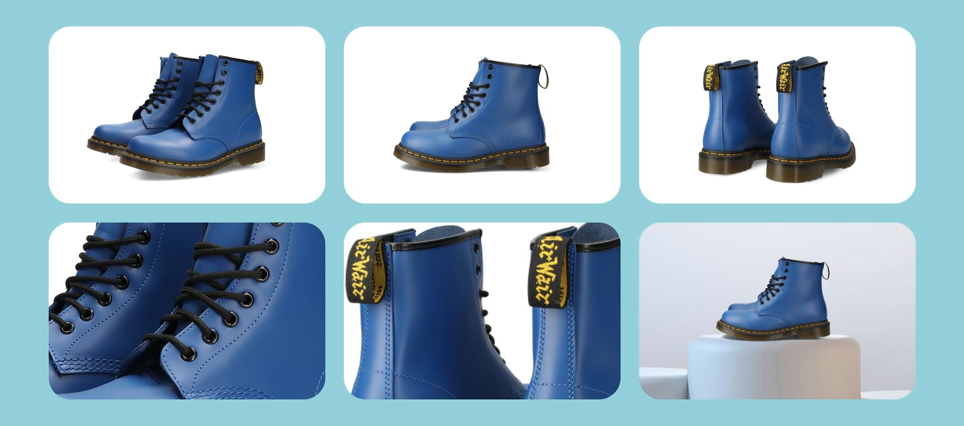
Plan a series of shots that you will reproduce for each new product. For example, three pictures from different angles, close-ups of details, and one context shot. Choose one style of product photography and stick up with it. If you sell garments, shooting on a live model will give the customer a better idea of the fit than flat lays. Packshots can complement lookbook shots in your online store.
Also, as hiring a live professional model can get pricey, consider using the ghost mannequin technique! It is a budget-friendly option that will allow you to present how the garment fits on a real body shape. However, it requires advanced product photo editing skills.
Visualize!
Create a storyboard and a list of all the takes. With every drop, product shots need to be easily repeatable. Every item should be shown with the same theme context shots from similar angles. The coherence creates a sense of order. Customers hate chaos and are more likely to abandon their carts after struggling to find accurate information on your website.
Remember that the time and effort invested at this stage can spare you a tremendous amount of post-production work!
Lack of know-how
Planning a product photography photo session and establishing a long-term content creation strategy can be overwhelming at first! We get it.
If you are not constrained by your budget, hiring a professional, experienced team can make a great investment in your sales results. In addition, the quality of your pictures can directly impact your brand's conversion rates and image.
Luckily we have something special for you! To get a better understanding of product photography, start with our guide.
Here is a short list of articles that should answer your questions:
- How to choose the best camera for product photography?
- What is the best lens for product photography?
- What are the best camera settings for product photography in e-commerce?
- How do photograph models?
- How to photograph shoes?
- How to photograph jewelry?
- How to get started with clothing photography?
Not thinking like a marketer
In a highly competitive market, where customers have millions of similar options, the way you present the product becomes even more important. Unfortunately, many brands forget there is more to product photography than showing the item.
Showing instead of selling
These images are visual anchors meant to catch the customer’s attention immediately. Instead, they should be brand specific and tell a story about the product, who it is intended for, and what values the company stands for. Never use someone else’s images, even if you sell the same product!
Use this opportunity to showcase your brand’s unique style or tell a story through images. Think of brands such as Sézane. Their product images follow the same theme for live model shots and still nature. Even out of context, their pictures are easily recognizable to their customer base and represent the brand’s unique style.
When used well, product photography is a powerful marketing tool to convince customers of the value the purchase can add to their lives. Lifestyle or context shots enable the customer to imagine themself using or styling the product and can significantly improve your sales. In addition, product photos should answer customers’ potential questions, improve the listings and click-through rates.
What is the difference between showing and selling? Whenever potential customer enters a brick-and-mortar store, they are usually approached by a sales assistant offering help and selling them an already displayed product. Well, good product photos are supposed to fulfill this role.

The images should realistically represent the product from different angles and feature all the important details, such as buttons, the lining, the texture. It is crucial to remain truthful so the customer can make an informed choice. This is how you display the product. Now, let’s build on that!
Think outside the box. Highlight what makes the product special. Add lifestyle and context shots showing its benefits. Create an image your target audience aspires to live. Tell a story that the viewer can connect with. Engage with values.
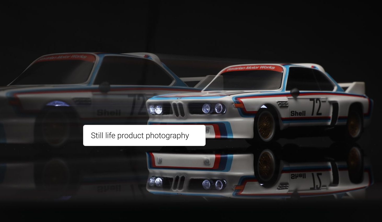
Here are examples of sales-oriented product photos:
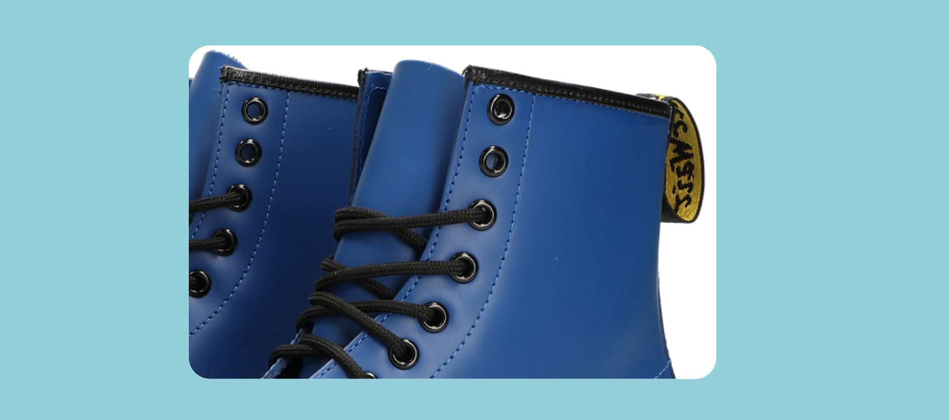
Showing Details
A close-up of detail makes the product special.
How to use
Product pictures can also serve as short manuals to give the customer an idea about the functionality.

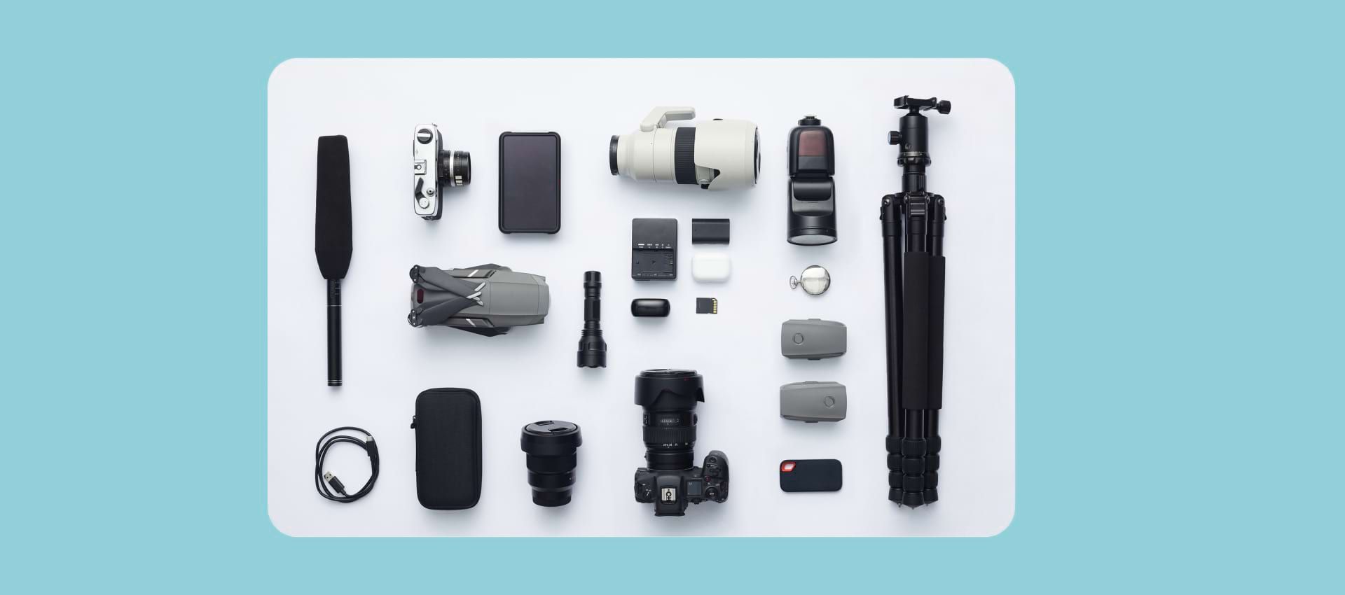
Unboxing
Show the customer what accessories come in the box with the product. For example, a smartphone with a charger, a manual, a warranty card, and a phone case.

Break apart
This example works great for tech products.
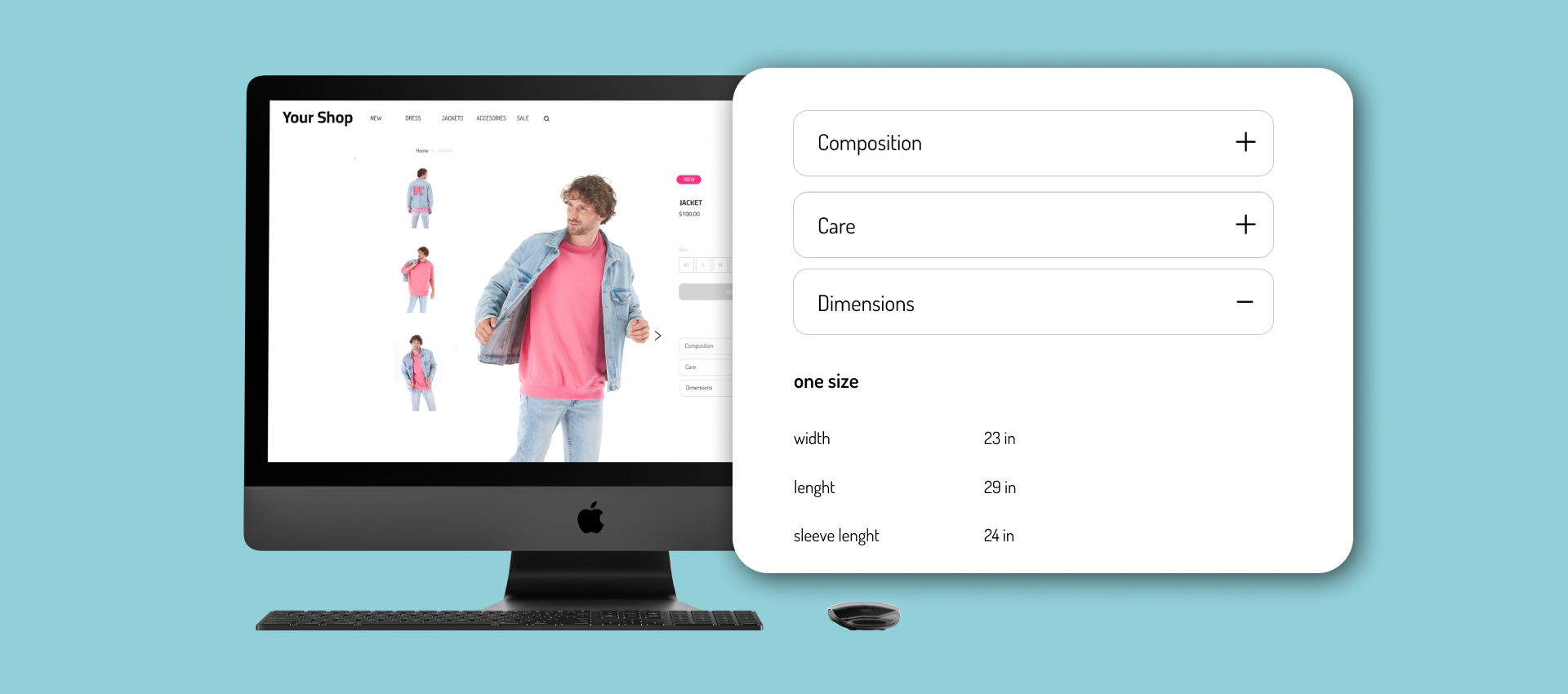
Tech Specs and Measurements
A photo showing the product’s dimensions.
Not using smart SEO
It is a common mistake to associate Search Engine Optimization solely with text and keywords. However, SEO is crucial for generating organic traffic to your store, and product photos play a huge role in your ranking and visibility.
Using large images
Search engines’ ranking algorithm is based on several factors. The speed of your website’s load is one of them. Large images take longer to load, which impacts your website’s performance. To know where you are, use Google Console to analyze the Core Web Vitals of your store and make the necessary adjustments.
Remember that different e-commerce platforms have different requirements, but aim for your pictures to be between 100 kb and 200kb.

Wrong file types
Using the wrong file type can compromise your website's performance. Stick to using compressed JPEG.
Not adding alt tags
Alt tags, also called Alt text, are additional text data fields meant to convey what the image is all about and translate it for the search engine. Alt tags are limited to 125 characters. It is not a space to list all your keywords! Write a clear explanation of what can be seen on the picture for visually impaired viewers. Do not make the mistake of leaving the field blank, as it can boost your search ranking!
During the photoshoot
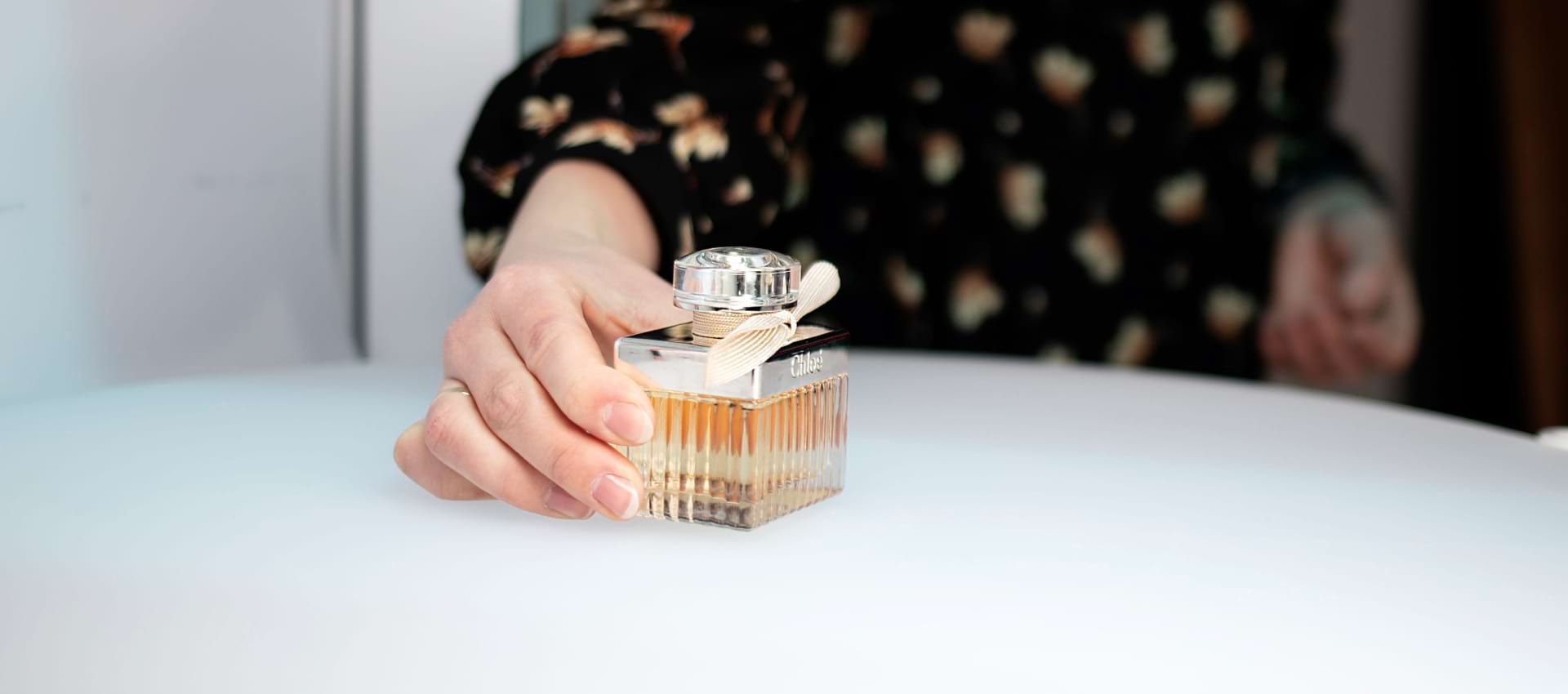
Not preparing the product
The product is the main character of your photo shoot. No expensive equipment can compensate for neglecting the prep, and it can cost you extra time and a headache during the post-production stage!
- Make sure all the elements are correctly assembled.
- Remove the packaging and labels.
- Clean the product - polish reflective surfaces and remove dust between takes.
- Steam the garments and make sure they fit the model perfectly.
- Watch out for loose strings, lint, and stitches.
- Pay attention to unwanted details in the background.
Learn more about how to prepare a product for a photo shoot from our product photography guide.
Not shooting enough photos
As mentioned in the planning section, showing as many angles as possible is important. The more images you upload, the better the customer can visualize the product. On the other hand, not providing enough photos can discourage the prospect, incite them to ask additional questions that could be avoided, or result in disappointment with a received order. Imagine what questions the client could ask and address them through your photos. Try to include:
- Different angles, preferentially a 360° view.
- Close-ups to details.
- Context shots.
- Product features.
- The garment is in movement.
Bad lighting
Lighting is what makes or breaks a photo. Therefore, it is critical to get it right. Remember that no matter how good your camera is, the lens will usually desaturate the real-life appearance. Therefore, before hitting the shutter button, take a moment to adjust the lighting. In post-production, editing an overly-lit image is easier than fixing one that is too dark.
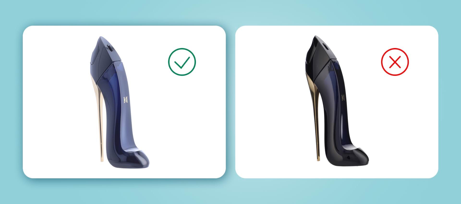
Avoid shadows. If you use artificial lighting, the product should be lit from all sides. If you are shooting close to the window with natural light, use a reflector to light it uniformly. It is important to light the background, not only the photographed object. However, this can be easily fixed with the help of an automated background remover. Because of the short exposure time, use a tripod to ensure the high repeatability of shots.
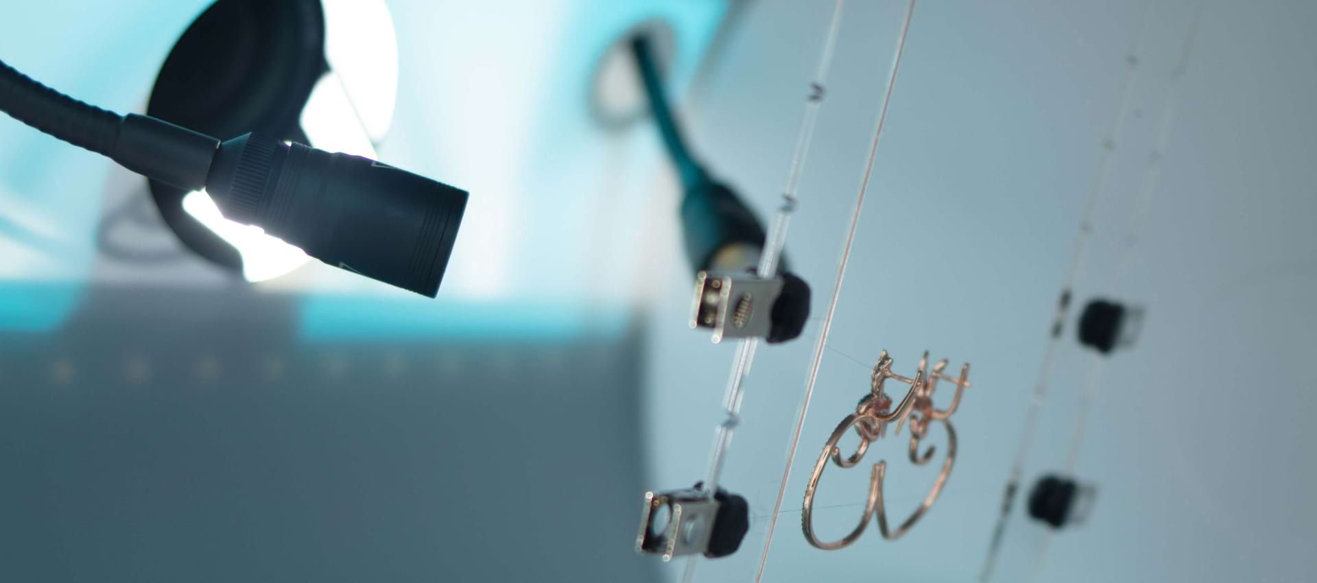
Try using different lights - the main light source placed in front of the product, for example, a light ring, secondary low-intensity lights, and a backlight, for better definition.
For smaller objects, consider using a light tent. It is a simple box with translucent white sides, a plain white backdrop, and one side open to fit a camera. It provides soft, diffused, uniform lighting inside for professional-looking product photos.
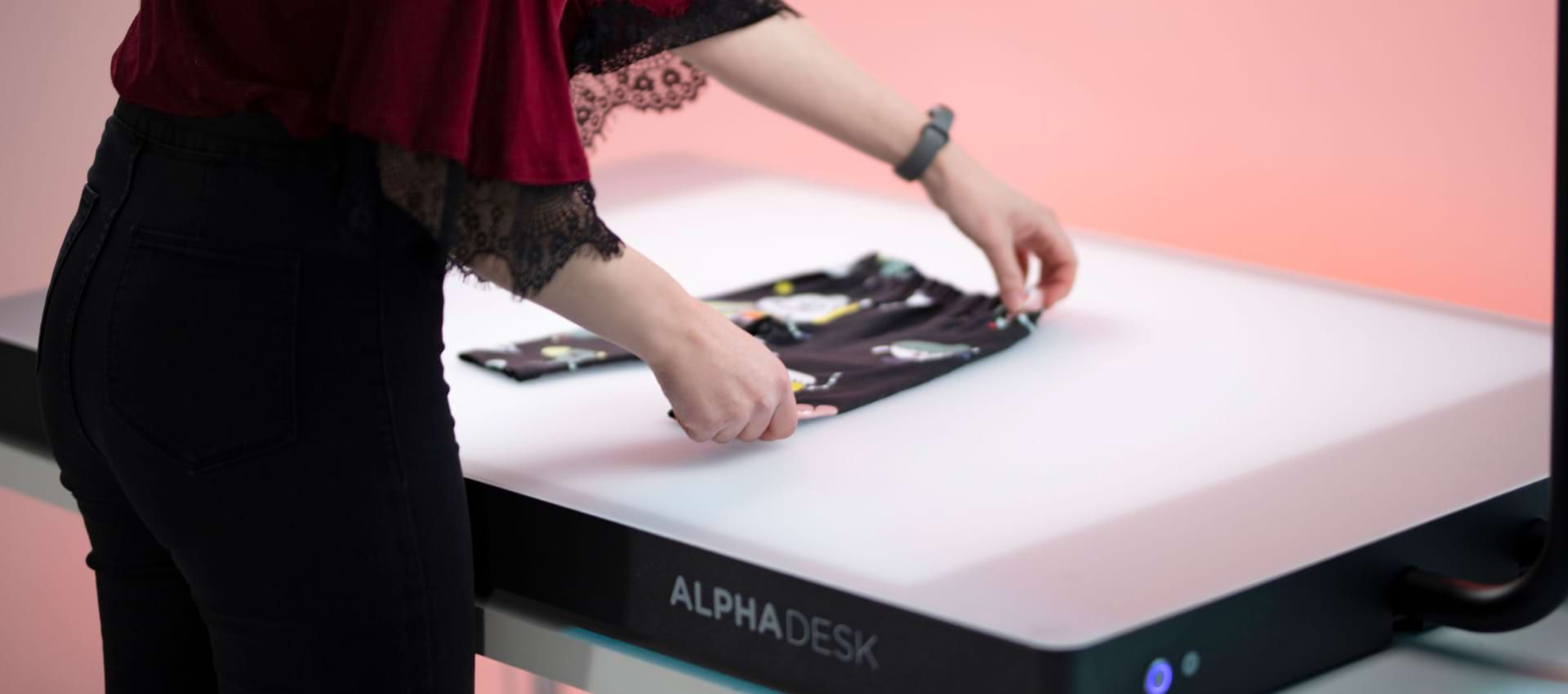
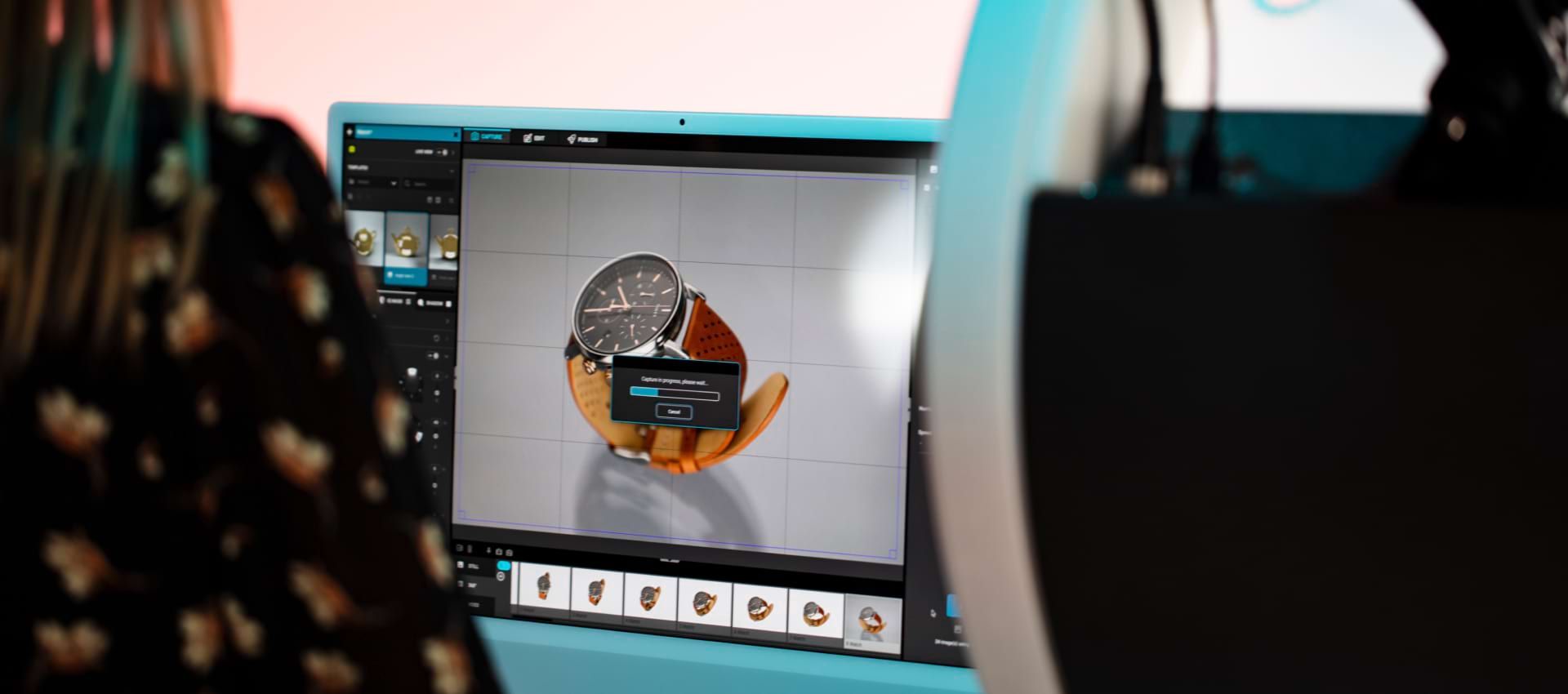
For flat lays, try Alphadesk or Alphatable, our dedicated solutions for automated flat lay product photography. The camera can be installed on a special mount. The table features lateral lights with adjustable intensity and range. A software suite streamlines the photo shoot results, keeping everything in one place and facilitating post-production thanks to features such as an automatic background remover tool.
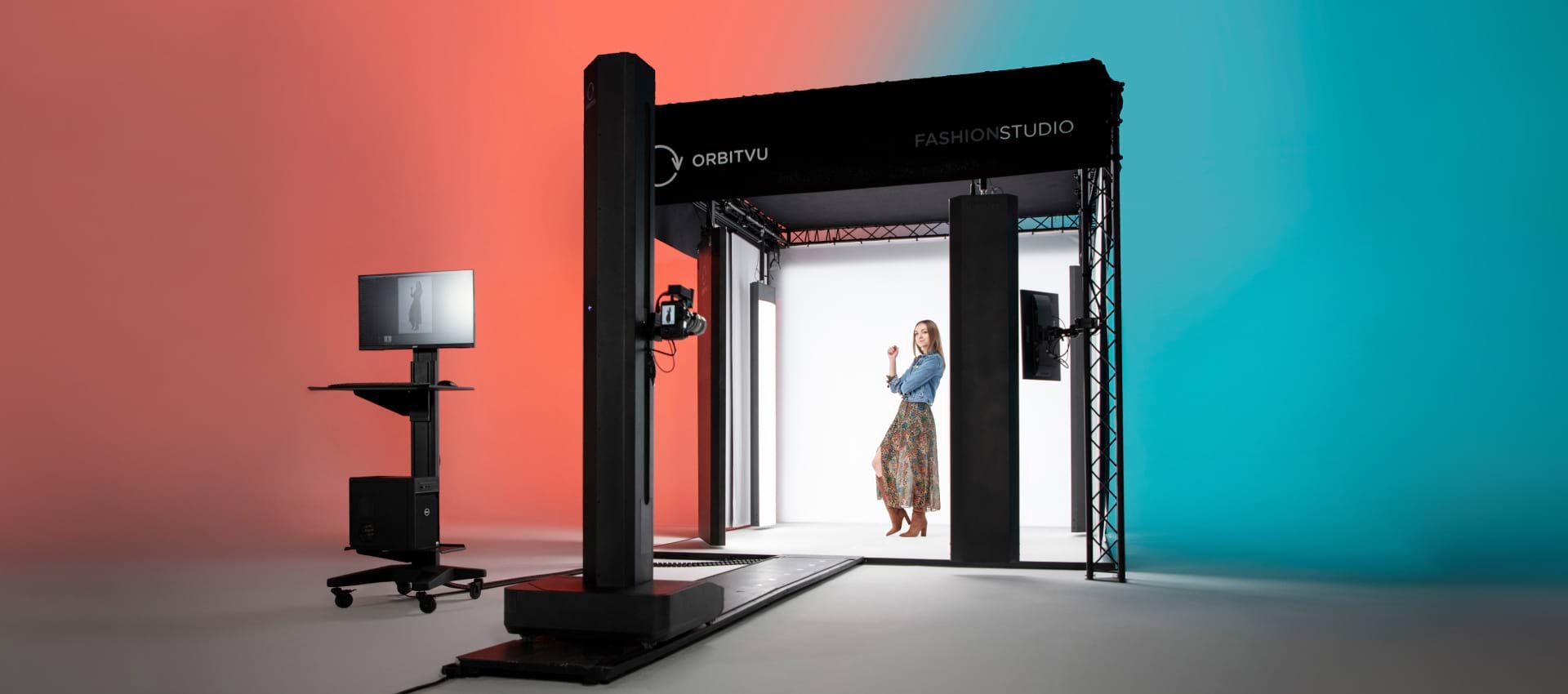
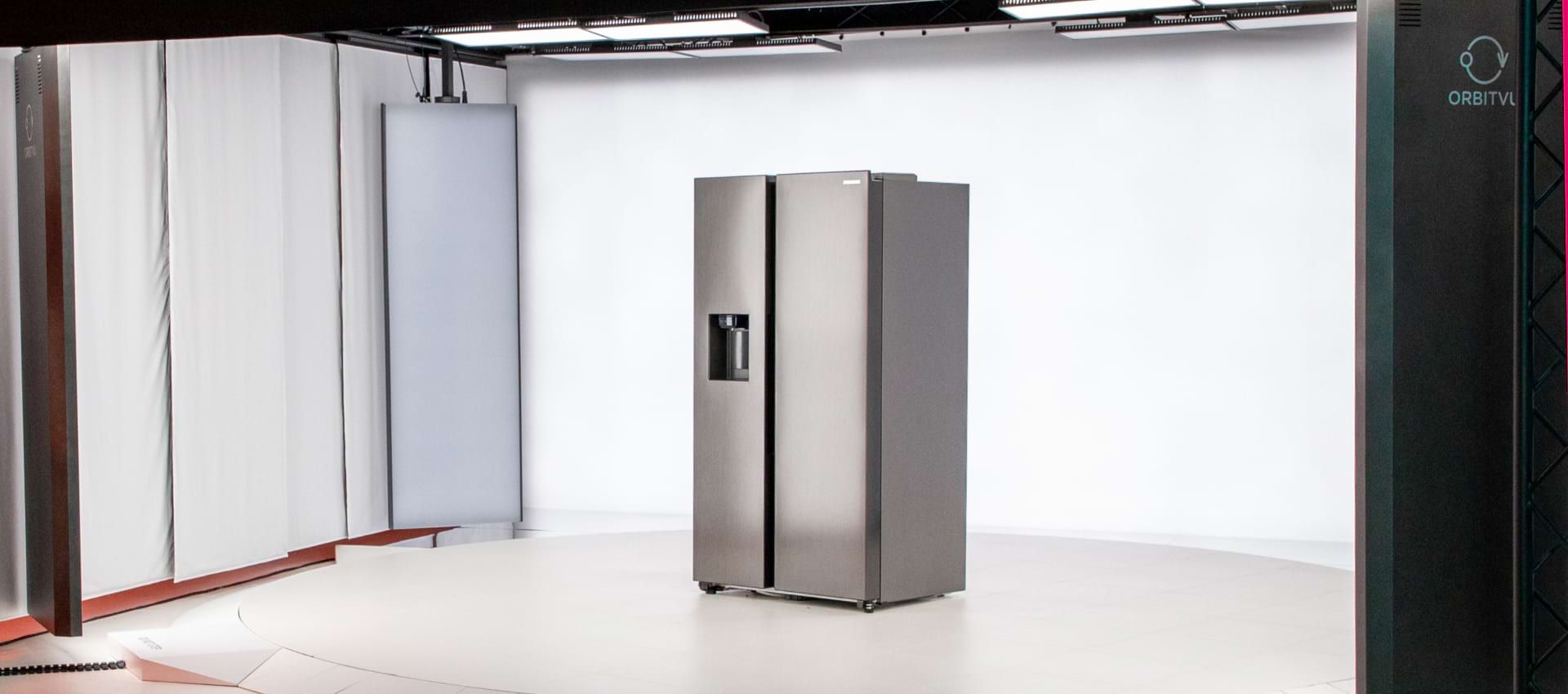
For shooting live models or bigger objects, automated fashion studios offer a perfectly lit space with a motorized stand for shooting videos. The sudios can be easily operated by non-professionals after minimal training. Automated solutions can effectively optimize your in-house content creation process.
Poor image quality
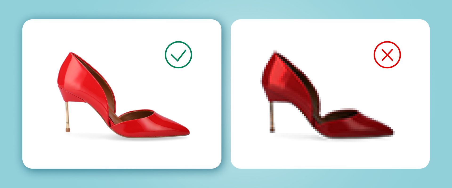
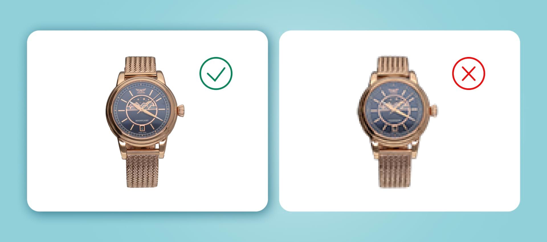
Low-resolution of images
High-resolution product photos, in general, look more professional. They provide details, clarity, and… higher conversion rate.
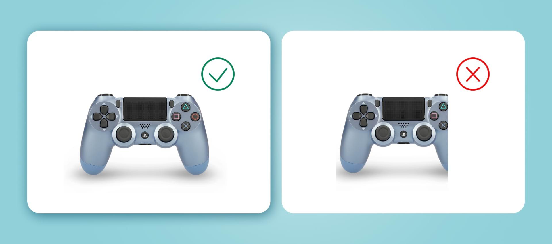
Bad angle
Although showing different angles is important, some can be unflattering or simply not show any important information.
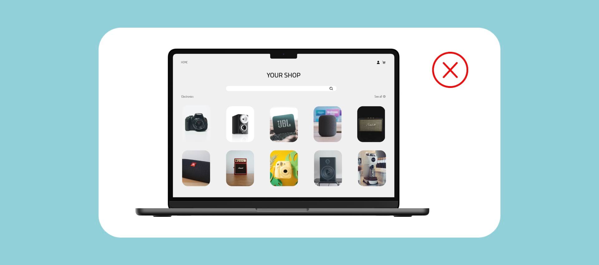
Inconsistent ratio
Why is it important? It can be difficult to design a layout combining different ratios. Your product grid should be symmetrical, and easy to navigate.
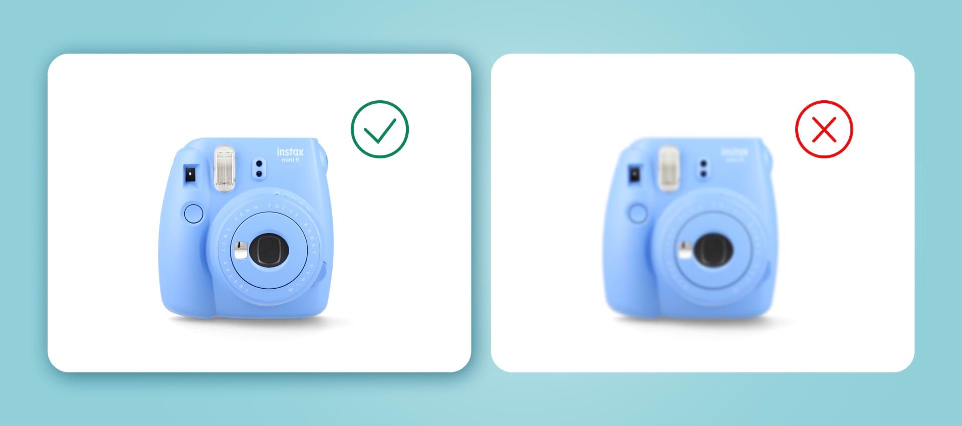
Blurry image
Use a tripod to avoid blurry, shaky images, especially with higher ISO. Aim for a maximum of 400-600 ISO to prevent noise. Keep your aperture above f/11, allowing you to capture more details in full focus.
Overpowering busy backgrounds
When seeing the product photo, the customer should immediately know what it is about. More props or an overpowering background can easily distract attention from the actual product. Plain white background, even a simple white sheet, is the safest option.
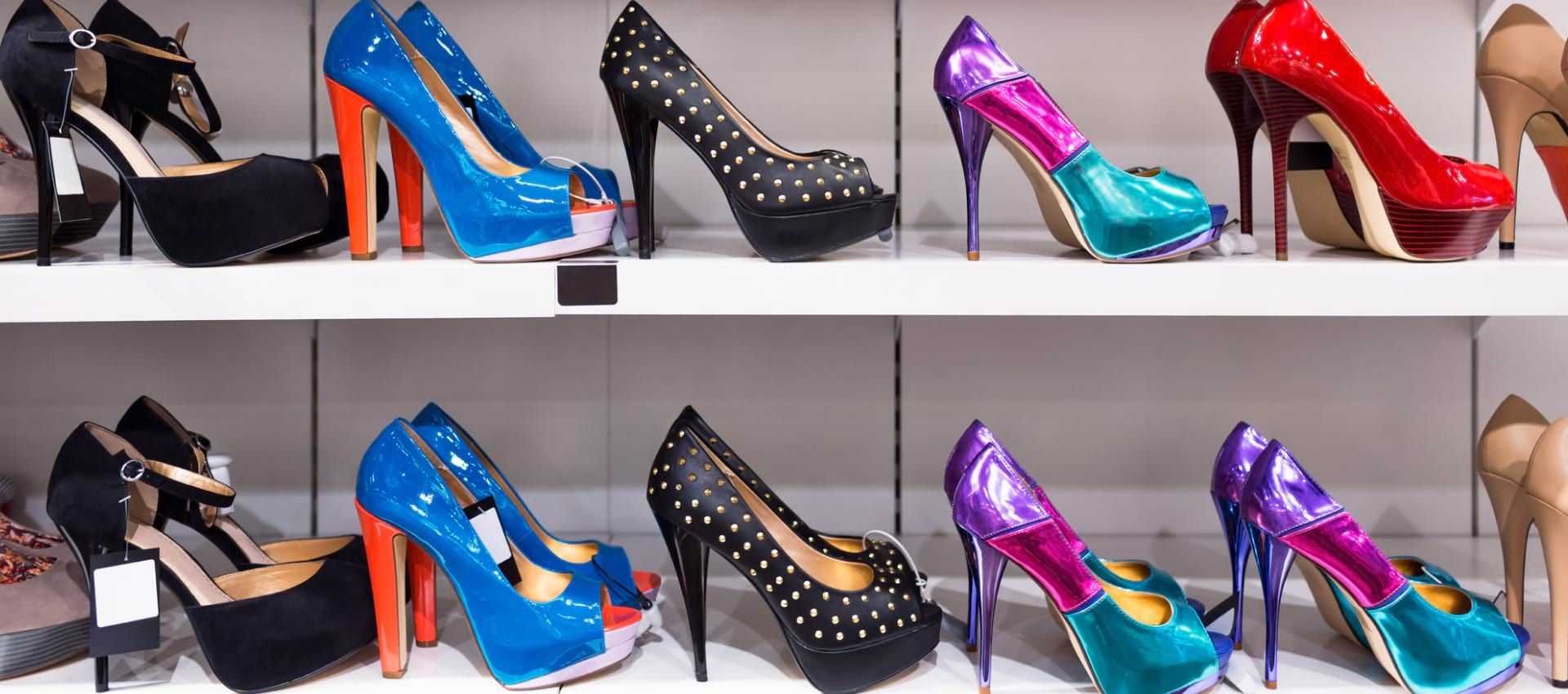
However, the background can add to the atmosphere you want to create around the product, for example with still nature or lifestyle shots. Make sure the props only add to the picture’s main character! Also, the background should fit with the brand’s visual identity and the customer’s perception of the product.
If you choose to use a background other than white, make sure all of the shots are coherent and will not clash when uploaded to your online store.
Post shooting
Going overboard during post-processing
There is a fine line between enhancing your product images via photo editing and overdoing it. But unfortunately, neglecting product photo editing is also a common mistake among e-commerce owners. If you lack experience in this matter or simply do not have time, consider hiring a professional photo retoucher.
You can also learn about easy post-processing tricks from our YouTube videos!
See how easily you can achieve reflection effect below.
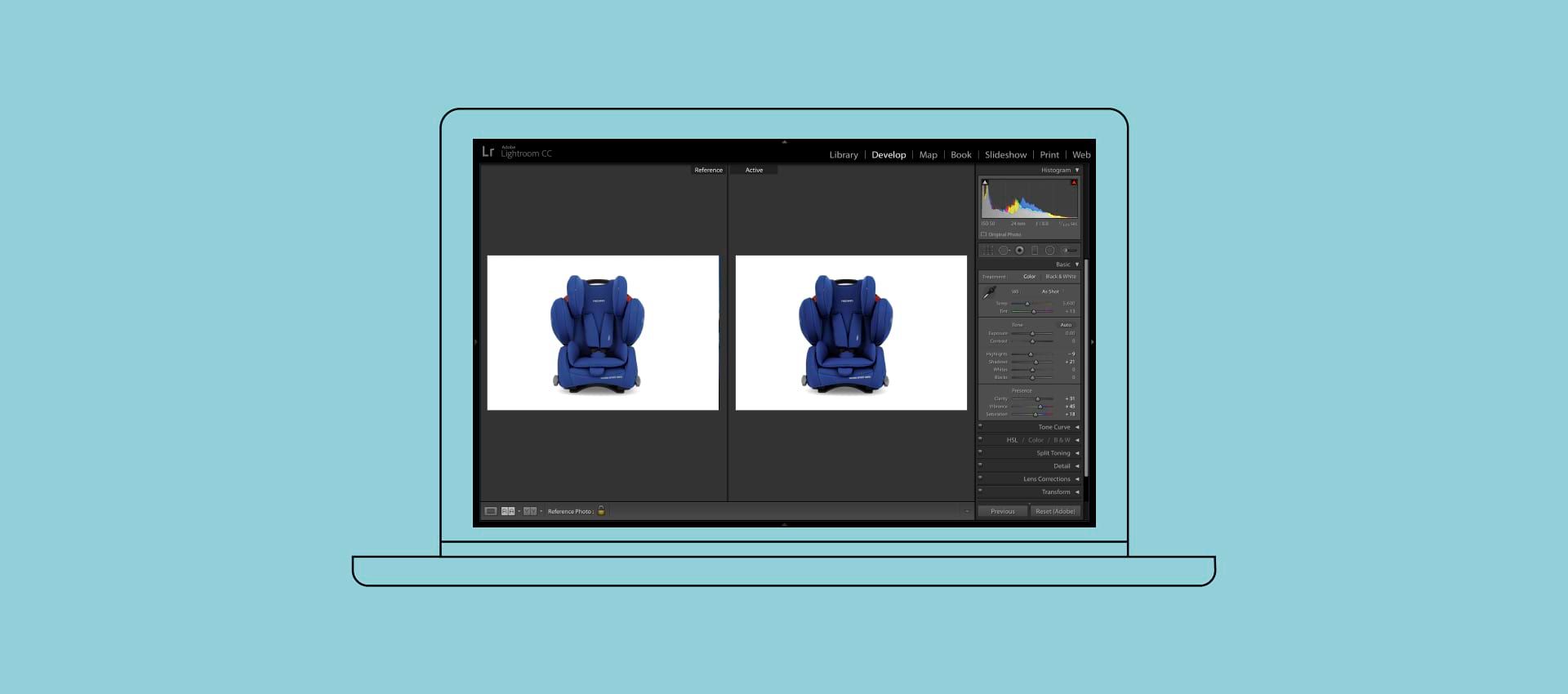
Photo editing software lets you erase shadows, de-wrinkle the tissue, remove reflections or background, and correct contrast and color saturation. It is essential to bring the color as close to the real-life version possible so the buyer can make an informed decision.
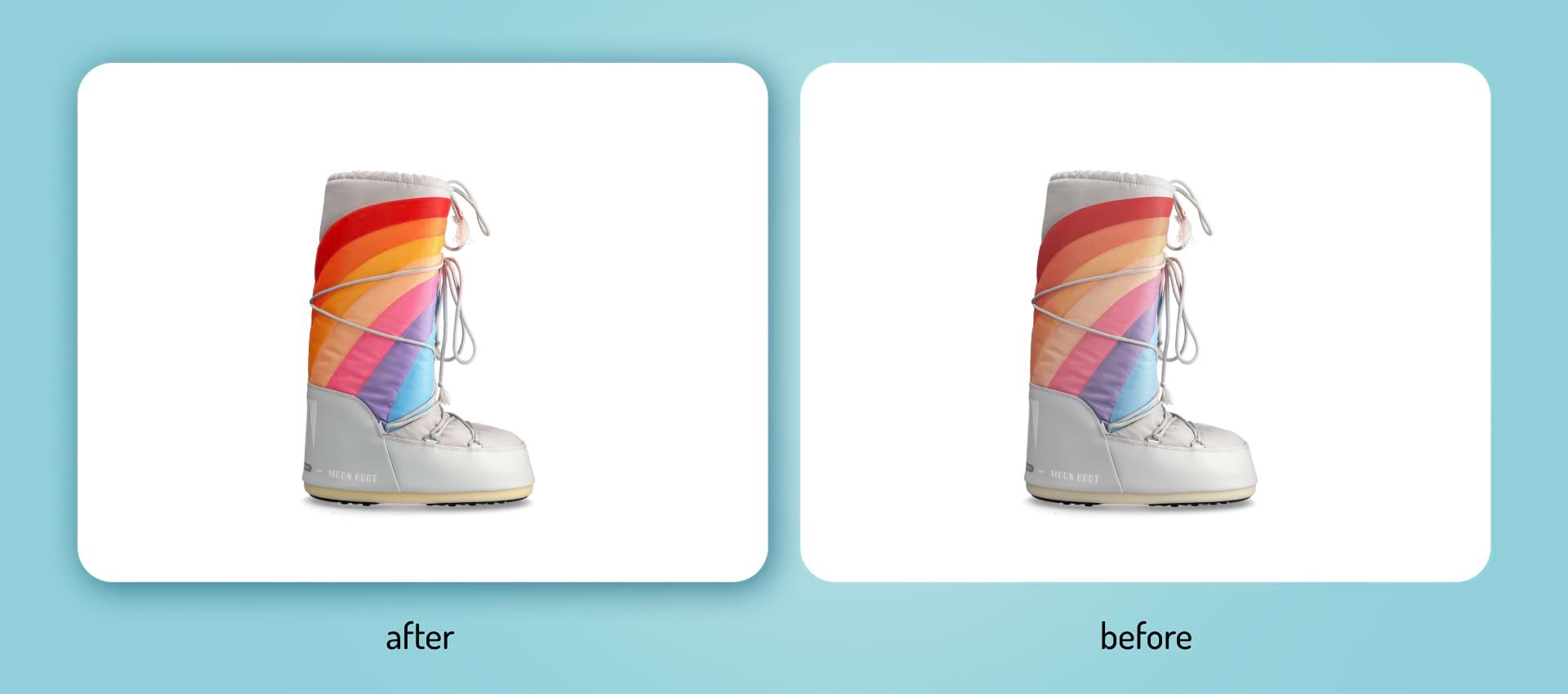
The shots should be consistent with one another to make your website look more clean and professional. Similar proportions, shadow alignment, and color theme contribute to your visual identity and help the customers spot an off-brand product easily. Save your presets to easily apply the same Photoshop adjustments to your photos.
Stunning product photos on a poorly designed website
So you planned a photoshoot and created a marketing strategy. You successfully shot and edited amazing photos. You did a great job! Now it is time to upload the final images to your online store. No matter how great your product pictures are, a poorly designed website can defeat all your efforts.
Poor User Experience
Is your website intuitive to navigate? Is the call to action easily clickable? Is the menu easy to find? All that matters and can discourage the potential buyer from placing an order in your store.

The layout of your website should be clear and easy to read. The images should be similar in size and fit into a template. Do not overcrowd the product with too many elements that distract the buyer.
Vague Description
Be as precise and meticulous as possible in your descriptions. Mention the measurements or feature a size chart. List all the tech specifications, ingredients or composition, and maintenance instructions. Provide the model’s height and the size they’re wearing to facilitate the buying decision.
Neglecting the Mobile Version
According to the SaleCycle 2023 Ecommerce Stats & Trends Report, mobile sales make up 55.25% of all online retail transactions, expected to grow in the following years.

Do your product pictures display correctly on mobile product pages? If not, focus on adapting them for mobile viewers. Make sure each product image appears in a preview and can be easily zoomed in.
Try to go through the checkout process on your mobile phone. Many buyers abandon their carts at this stage if it does not go smoothly.
In Conclusion
There is so much more to great product photography than showing the item! Pictures should truthfully represent the products and provide buyers with all the necessary information to make a purchase decision. However, images should also tell a story, inspire emotions and engage the customers.
Product photography is an investment. It is set to capture attention, convince, and keep the buyer’s interest. Our automation solutions can help you optimize the process, shorten the time-to-market for your products and increase savings at scale. Feel free to contact us to learn more!
