
Table of contents
Before you start
According to the Global News Wire’s 2021 study, over 54% of global shoppers enjoy online window shopping more than in-store browsing. Users also spend considerably more time browsing on their phones than in brick-and-mortar. Mobile devices have all the e-commerce world has to offer at their fingertips 24/7. Yet, even if online browsing became a preferable way to research and gain product awareness, customers seem to lack the confidence to purchase. When it comes to spontaneous purchases, traditional retailers remain the top choice.

So how come most purchases still take place offline despite the exponential growth of the e-commerce sector? What should an online store offer to compensate for the lack of a full sensory product experience? How to turn browsing users into actual paying customers? That is where a good e-commerce merchandising strategy comes to play! Let us walk you through it.
What is ecommerce merchandising, and how does it work for online retailers?

Merchandising is the practice of using various techniques, such as advertising, promotions, and presenting the product in a flattering way to increase sales. In traditional retail, merchandising refers mainly to attractively displaying products and using strategic placement. Although it can be summed up in a simple „see it - like it - buy it,” traditional merchandising rules are based on years of thorough psychological studies. There is no place for coincidence.
There are two main scenarios. First, the customer is looking to buy necessities, such as groceries. Chances are, their decision to enter the store is mainly motivated by commodity, localization, and price range. In the second scenario, the customer walks in intrigued by an eye-catching storefront.

Inside the store, strategic points are placed on opposite sides, forcing the customers to walk through the alleys and see the products outside their initial shopping list. Many studies were led to analyze the movement of shoppers’ eyes to define the optimal scheme to arrange the merchandise. Most customers tend to look right when entering a shop. Therefore, the most expensive products are often placed on the right side and the eye-level shelf, while cheaper or generic brand alternatives should be fined on the lower shelves.
The main advantage that brick-and-mortar stores hold is the possibility to engage with customers through all their senses:
- Visually appealing store layout and presentation that shows the product in use to guide customers. For example, IKEA, with its furnished and decorated spaces
- Possibility to touch, hold and test the product and feel its weight and texture. For example, Sephora offers testers and free make-up sessions.
- Creating the ambiance that contributes to the brand’s image. For example, Abercrombie with its dim lighting and representative scent.
Personalized in-person assistance.
How does it translate onto online e-commerce merchandising?
Several factors undoubtedly contributed to the popularity of online stores. The convenience of browsing from anywhere at any time and the variety of digital advertising are huge advantages. The abovementioned study confirms that e-commerce sites are successfully catching customers’ attention, leading to them browsing and discovering new products. However, a high number of potential customers does not translate into conversion rates - many are still hesitant to purchase without seeing the product in real life.
E-commerce sites offer endless options at the tip of the user’s fingertips, yet, through a barrier. The biggest challenge of online merchandising is to compensate for the lack of a full sensory product experience and fill in the gaps to earn the trust of hesitant potential buyers.
Let’s go through the parallels. The visual content featured in digital ads and the above fold space of your website should grasp the customer’s attention and prompt them to click through. It is also a great place to inform them about your free shipping and return policy. For most, the additional cost of shipping or exchanging the product they are unsatisfied with constitutes a barrier. Customers having trouble finding the right fit prefer in-store shopping to spare themselves the eventual hustle. Also, the customer is often unaware of the exact shipping cost until they validate the cart. According to Baymard’s Institute research, this is one of the reasons behind cart abandonment, which currently reaches an average of 70.19%.
Another popular strategy that can significantly lower this barrier is the „satisfied or reimbursed” promise. Some brands, for example, popular online mattress-in-a-box retailers, offer a 100-night trial to compensate for the lack of seeing the product pre-purchase.
Remember what we said about the store layout? Physical stores use category-based merchandising, and so should your e-commerce site! Be sure to attribute products to the right categories. Customers can get easily discouraged by a chaotic inventory management style. Also, keep your customers updated on the remaining stock.

Although there is no in-person assistance, AI virtual assistants or automated chats can guide customers through most recurrent issues 24/7. Including reviews from other customers, star ratings, frequently asked questions, and user-generated content can also build trust and lead to a conversion.
Remember that 60% of existing customers are millennials, and 49% declare they would likely repurchase after a personalized experience. Similarly to a sales assistant advising a regular client, you should collect, track and analyze buying habits and how users interact with your e-commerce site to show them the products most likely to fit their tastes or needs. How to provide a stellar personalized customer experience in your online store? E-mail marketing can help you achieve great results!
Why investing in visual merchandising is your best bet?
The visual content is meant to attract customers' attention, ignite their interest and encourage them to click through. The quality of the photography impacts the brand’s perception and customer’s trust. Your product photography should be coherent with your brand’s visual identity, easy to recognize and associate with your e-commerce. For this reason, it is a good idea to take some time to plan and establish your communication strategy. Create a brand book that will define all the elements contributing to your brand’s personality - colors, fonts, images, logos, sounds, smells, or even materials.
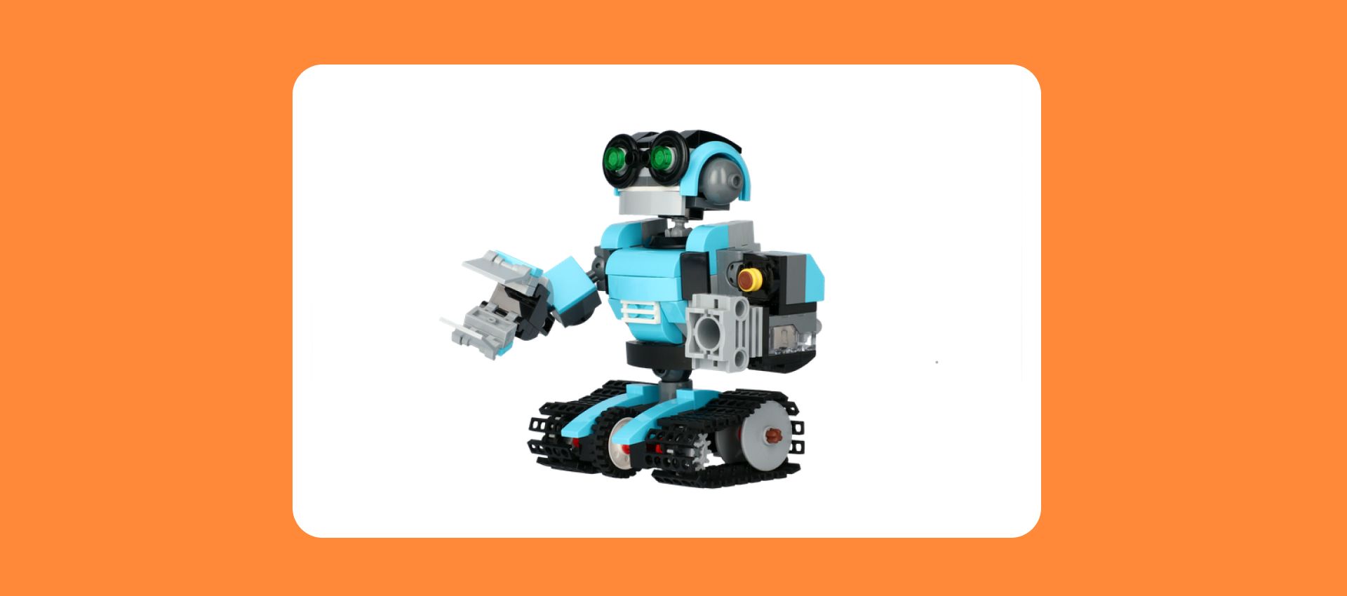
Inform
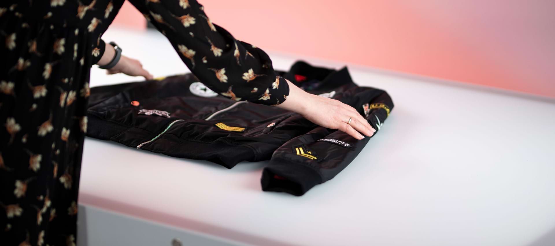
Besides being visually appealing, your product images should contain as much information as possible. Photos are the only way to experience the product for a customer shopping online and should convey all sensory aspects. Show the texture, the weave, and the fluffiness of the tissue. The potential buyer should be able to imagine how the product feels through your visuals.
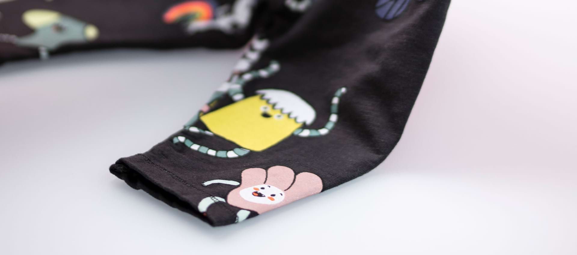
Show context
When selling perfumes, show the ingredients so the customer can imagine the smell instinctively. For clothes, feature pictures of the same item on different models, with information about their height and size.

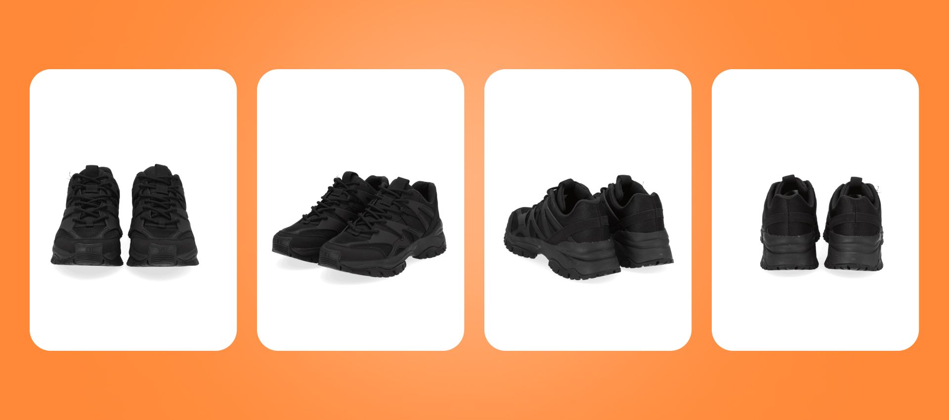
Change the angle!
Also, include several shots to show the product from different sides and angles, from far and in close-up. Do not limit yourself to packshots! Additional context photos can truly shift the odds in your favor. In addition to being informative, they should ignite pleasant feelings and desire to purchase the product.
Moreover, context photos play a huge role in conveying what the brand is all about. They show the buyer who the product is designed for and what lifestyle they should aspire to have.
Provide an immersive experience
Today, more and more e-commerce sites also include 360 views - this is as close as the buyer can get to fully experiencing the product through the screen. This type of photography might initially seem tricky to shoot manually, but with our automation solutions, you can achieve the same effect without prior experience or training!
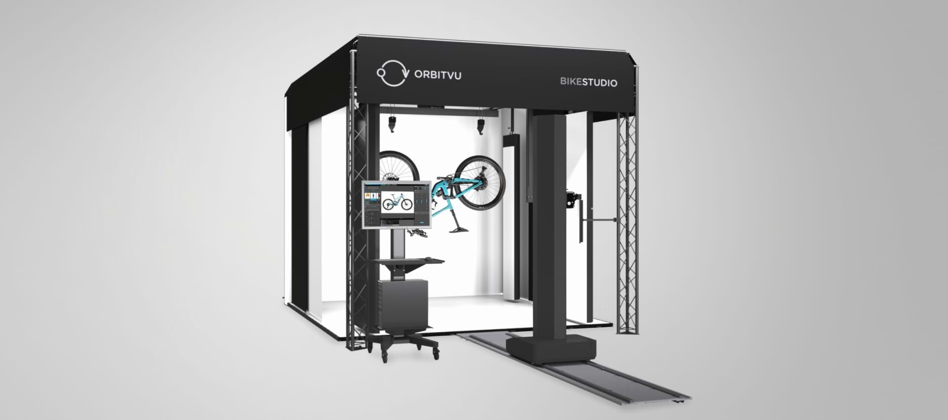
As you can see, visual content is critical to a good e-commerce merchandising strategy! Investing in quality product photography can get you a long way. Keep in mind that showing an item is simply not enough. You have to sell it through your images!
What else?
Once the customer’s attention is on your product, it is time to convince them it's a perfect fit. Even the best product photos will not compensate for a website that does not load properly or hasty proofreading.
Copy!
First of all, the product description should include all information about the product. Anticipate potential questions and have the answers. Remember to adapt the language register and communication style to your target group. The narrative of your copy should replace the in-person sales assistant selling the product through the language of benefits. Describe the product flatteringly, but avoid exaggeration - sure, it can convince someone to make a purchase, but it is not worth their potential disappointment. Also, remember to include a clear call to action to guide the customer.

SEO
Your copy should also include keywords you want your product to be associated with. How to make sure your webpage positions well in search engine results?
- Use keywords but avoid keywords stashing.
- Write unique texts, titles, meta-text, ALT text.
- Use links wisely.
- Optimize the site’s loading speed.
- Optimize your product images.
- Create a clear website hierarchy.
- Polish the mobile version.
- Analyze customer data and learn from your mistakes.
Website of your Online Store
Several aspects of your website will influence how it positions in search results. Your e-commerce site is a structure that supports your merchandising strategy. Make sure it is solid!

Landing page in your ecommerce merchandising strategy
Imagine your landing page as a storefront for your e-commerce business. It should be clear, coherent, and manageable. First, welcome your customer. Optimize User Experience to make their journey fluid. Most sites include a drop-down menu with category pages; you should too!
The landing page is a perfect place to feature information about free shipping and special offers. Include the company’s logo, slogan, the ABOUT US section link, and contact information.
Only feature a few items at a time. Focus on one category, for example, trending products, highest rated products, or bestsellers. These are the two groups the users tend to interact with the most. Make sure the elements are clickable and lead to the right product pages.
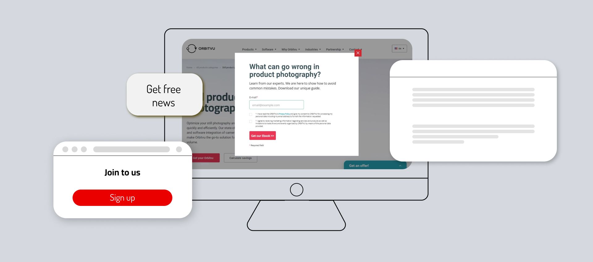
Many pages are great site visitors with a pop-up! There are many templates to choose from:
- Newsletter subscription form
- New product alert
- A special discount code
- Information about a flash sale
- A survey
Remember, a call to action! It should be clear, unique, and clickable on desktop and mobile devices.
Product pages
So you have managed to spark the customer’s interest, and now it's time to convince them to make the purchase - in other words, the product page is the place to sell your product. In a traditional store, the potential buyer takes the effect off the shelf for a closer look or takes it to the fitting room. A good product page should give the customer the fullest experience possible through a screen.
Yellow bag in 360 view. Notice how the reflection is playing on the material revealing its glossy finish
Your photos and product videos should respond to all the potential questions. Make sure to show the item from different angles and highlight the detail. Ideally, provide a zoomable 360 view. It pqis crucial to ensure that your interactive visual content works on mobile and desktop devices. Add some context shots or user-generated content, for example, users wearing your product! Remember to fill in the All text to make your content more inclusive and transcribe your images to search engines.
As mentioned above, your visuals should be accompanied by a compelling copy, technical details, measurements, and composition details. Also, consider including reviews and ratings - studies show potential buyers are more willing to trust websites featuring customer feedback.
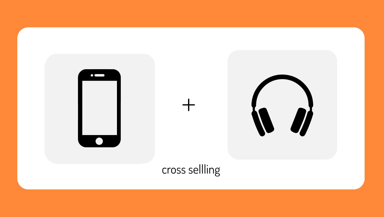
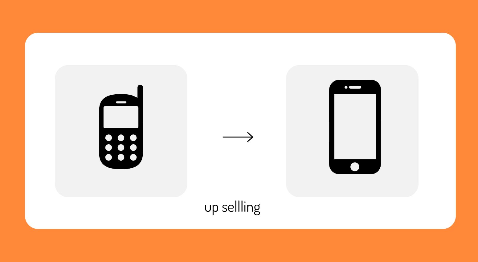
Your ecommerce merchandising strategy should also involve complementary product suggestions. It is a great technique to boost the average order value. Upselling offers a choice between a basic and an upgraded version - for example choosing between different memory sizes, 4g or 5g, when buying an iPhone. On the other hand, cross-selling comes down to offering complementary products or services - for example, a list of other clothes the model is wearing in a lookbook shot.
Search bar
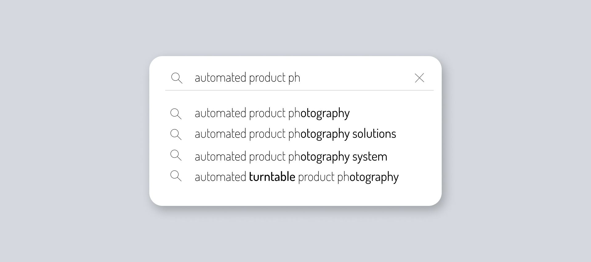
It is another must-have for any e-commerce website! Ideally, aim for an auto-fill option. Natural language processing technology enables the searching tool to correct typos, mental shortcuts, associate similar keywords or understand words borrowed from other languages. To improve the customer experience, include filters by size, color, price range, etc.
Predictive search can efficiently increase sales. Let’s have a look at Sephora’s website, for example. The search tool directly suggests specific products in response to a keyword. When it comes to online shopping, an optimized search tool showing relevant products should compensate for the presence of a sale assistant in traditional retail.
Final Thoughts on Online Merchandising
Now you know how traditional merchandising translates into online stores. A solid e-commerce merchandising strategy can hugely impact your conversion rates and boost sales. Remember that automation solutions can significantly facilitate content production for your e-commerce site. Yet, even the best visuals will only work with compelling copy and an optimized website.
To learn more about how product photography can increase your e-commerce results, check out our blog!
