Table of contents
- Before you start
- Why optimize product images and how to start?
- Resolution optimization for product images
- Website layout and optimal resolutions
- Display screen and optimal resolution
- Output file size and optimal resolution
- 8 rules for website image optimization
- Color space optimization for product images
- 12 rules for SEO image optimization
- Conclusions
Before you start
In our ultimate guide we will give you hints on how to optimize product images for online presence, so that it never happens to your customers. You will learn how to eliminate tedious page load times and situations when the product photo just doesn’t look device-friendly.
We start off by asking the simple question, “why optimize?”, and then guide you through the arcana of resolution optimization and file size management. Finally, you will get a chance to learn about the basic tenets of image SEO optimization, which is an integral part of a seamlessly working e-shop.

Why optimize product images and how to start?
An online business will always hold time and money as assets. Learning to manage them effectively is part of the success and it doesn’t go without streamlining product photography processes. You will want to produce images that sell and images that smoothly guide your client through the website rather than create obstacles.
Such product images will need to be optimized as to their visibility, download size and search engine positioning. There is no escape from tackling these parameters, if you aim at cost reduction and value the experience of your users.
With image optimization considered, you will gain a quicker and leaner website, which will contribute to savings on server fees. You will also get a better search engine position, which generates traffic to your website and increases conversions.
The easiest way to think of optimization will be to consider using smaller resolutions, introducing image compression and tagging images properly. This will involve choosing image formats, some resolution post-processing and a certain amount of webmastering.
We will guide you through all these.
Resolution optimization for product images
To begin with, let’s have a quick look at what resolution is. For a basic definition, it is the number of pixels an image consists of. It is usually expressed in the vertical and horizontal numbers: the width and height of an image in pixels, e.g. 1920×1080.
The more pixels an image has, the better the details can be represented for the viewer. The below example illustrates this situation.

High resolution

Low resolution
When it comes to resolution optimization, there is no one simple solution. To choose the optimal resolution for your product image you will take into account the following characteristics:
- the website layout.
- the display screen.
- the file size.
Website layout and optimal resolutions
Aiming for the highest possible resolution will not be a recommended strategy, even though it might seem that “more pixels mean more details”. In the case of online shops, this would rather change “to more load time” and “mistaken display”. Your web-technician and SEO analyst know it all well…
The website requirements are the first reason why you need to make your images and your system work together smoothly. Questions that your webmaster will help to answer can include:
- Does the website display miniatures?
- What resolution is needed for miniatures to look crisp?
- What resolution does the website engine propose for all categories of images for desktop, mobile, and tablet?
- Does your website have a close-up presentation system?
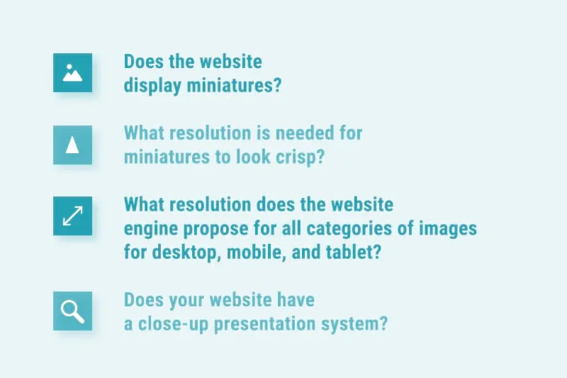
Knowing these answers will guide you through the first resolution choices you make. When planning out an online store, work in close collaboration with your web personnel. The knowledge they provide will spare your time in product image creation and post-processing. And, above all, it will be the first step towards the smooth display of images for your customers.
Listen carefully to web designers and choose the resolutions they propose for miniatures, close-ups, main listing images, etc. It will be much more effective to know them aforehead and later set optimal standards for photo generation in your enterprise.
Display screen and optimal resolution
The diversity of available digital devices will play an important role in setting the resolution guidelines for your product images. To view your products customers may use differently sized smartphones or tablets and multistandard desktop screens as well. How to suit them all?
This big question has no one answer. This is because there will be tens of possible resolutions your user might choose. Some of them will be more common, some less. You can measure your clients’ resolutions with most of basic website traffic management tools and draw conclusions from the statistics. Together with webmasters and graphic designers you will need to decide to suit the majority rather than the entirety of this group.

To understand the phenomenon of different resolution screens, let’s have a look at how one screen behaves, when we change its resolution.
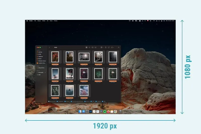
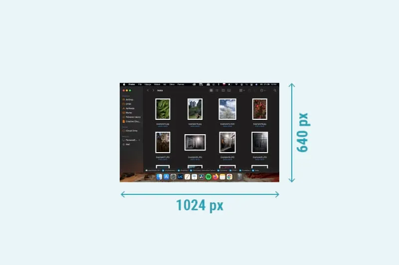
Depending on the resolution, the screen is able to display less or more. In laptop or desktop screens, the longer side of the resolution will be horizontal. In mobile phone screens, the vertical side will be longer. Already this simple difference generates requirements for images in your e-shop – e.g. should you cram more content vertically or horizontally?
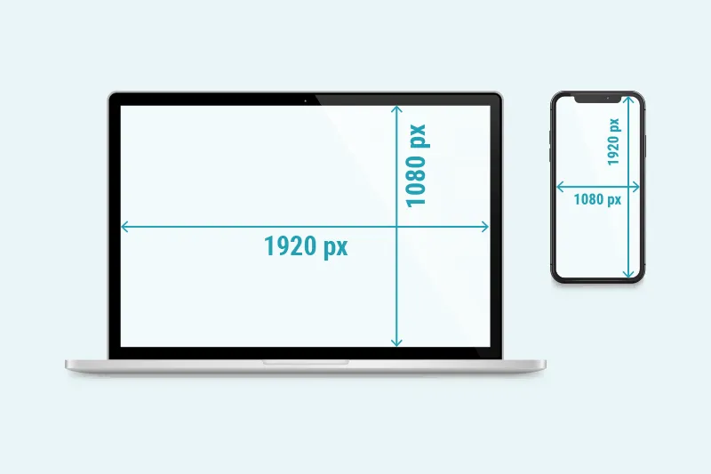
It is worth noting that in case of HiDPI (High Dots Per Inch) or Retina screens, common in modern smartphones and laptops, it is necessary to differentiate between so-called CSS pixels used by applications (incl. web browsers) and physical pixels determined by the producer of the device. In this case, for 1 CSS pixel one may count more physical pixels. The parameter that defines it is DPR – the Device Pixel Ratio.
High Dots Per Inch screens allow web designers to display images in various resolutions depending on what is supported by the screen. Normally, different versions will be prepared of the same image, each one in different resolutions. They will be placed on the website using the <img scrset> attribute, which will be read by browsers to display the image most conveniently. Get to know more about the topic from a website dedicated to screen resolutions.
Screens of resolutions like 4K and more are gaining in popularity, however it is still (2021) the fullHD resolution that is the most commonly used, whether laptop or smartphone. Our photo, viewed in 100% magnification, will behave differently in vertical and horizontal screens:
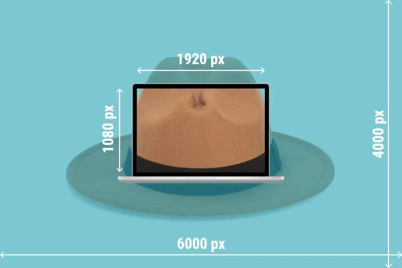
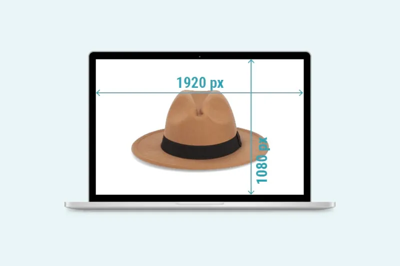
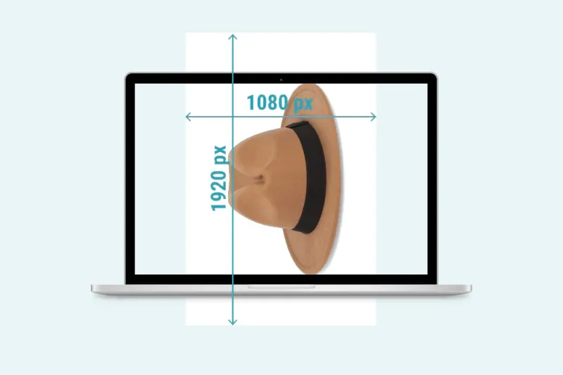
Mark that on a smartphone the 1920 pixels of fullHD will be the longer (vertical) side of the screen. Thus, our photo will be displayed as smaller than the surface of the screen.
The above examples illustrate a case study for the fullHD resolution. This being not the only resolution the customers use, you should consider adjusting the resolution “so that it fits more screens”.
This would mean introducing various image resolutions for different screen resolutions and loading them responsively. A solution that can be implemented in most of the website management systems.
Take care to prepare separate files for miniature images of the products, as they will load faster than a large image minified by the web browser. It simply takes less processing and download time, which gains importance when many product miniatures load on one screen in a grid or a row.
What’s more, the miniature actual size and the size indicated in HTML in its <image> tag can influence the parameters taken into account by Google when positioning your website. The rule of boosting website performance and SEO is to display exactly the resolution the file has on the server, no browser operations.
Output file size and optimal resolution
Extremely low resolution will mean a comfortably minimal file size. The opposite is true for an exquisitely high resolution. The optimizer will have to find a middle way to keep a reasonable file size, while not losing the detail level with the drop of the resolution. See below examples of file sizes.

Figuring out the optimal file size can be guided by parameters such as the number of images that need to be loaded simultaneously on one website. Imagine a product grid of hundreds of products where images are loaded in full resolution and then minimized by the browser. This would be a serious load for the Internet connection of the final user and make browsing virtually impossible on lower speed networks.
8 rules for website image optimization
Knowing how difficult it is to compartmentalize the knowledge of image optimization and how many faces and approaches it presents, we decided to prepare for you a shortlist of advice. Read on.
1) Choose the right format for your graphics.
For images of simple geometrical shapes and uncomplicated tonal ranges it is recommended to replace raster graphics with vector graphics. You can achieve the best quality:size ratio this way and gain incredible scalability. Vector graphics (e.g. SVG format) display equally well in high and low resolutions. They are recommended for logos, icons, illustrations.
Raster graphics (file type like PNG, JPG) will work for complicated visuals and photography. A bonus to their web optimization can be achieved with the WebP format – see point 6.

2) Use the right level of compression when creating the file.
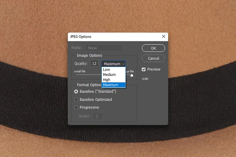
Photo edition software offers compression at the moment of saving the file, depending on file type. The slider can be set to maximize compression and obtain a small file or to reduce compression and go with bigger files.
The golden rule is to be found by each user personally, with a general suggestion to keep the compression above 92 percent. You should find a point where, without sacrificing quality, the image size is satisfying.
3) Use an advanced image compressor.
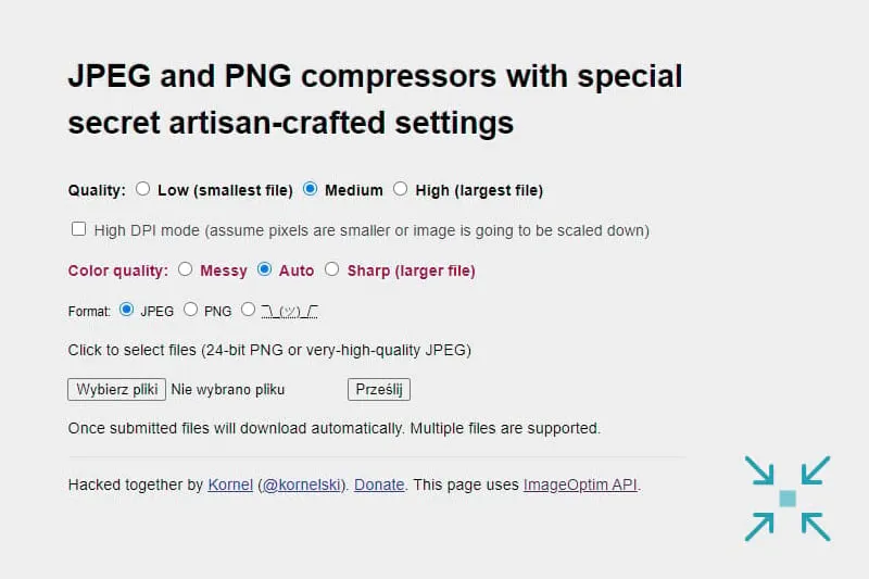
Big image files can be additionally compressed with an online image minimizer, which offers advanced algorithms to reduce the file size and keep the quality impression untouched. These tools usually operate with the most common file types.
Using them is as easy as dragging and dropping a file and downloading the result. Make image compressors your tools to save for web. Online services that we recommend include Tiny JPG and ImageOptim. You will find plenty of online rankings of image compressors, as these sites are really popular.
4) Replace GIF with videos where relevant.
GIF files tend to be heavy, especially if they include longer video sequences. It might be much more convenient to use various compressed video file types to save page load time and introduce display optimization.
You might even consider using embedded YouTube or other cloud videos, which will prevent the browser from downloading the video clips straight from your server and all at once.

5) Serve images responsively.
We have already touched on this topic. For website optimization, make sure your CMS serves various image versions to different screen resolutions and devices.
6) Use WebP, JPEG2000 and others.
Using the WebP format that appeared on the market already in 2010 becomes a boost for your website SEO and naturally saves load time. This format offers good quality image and low file size. However, the use of this file type may be limited by browser compatibility. There are also plenty more web formats available, which, however have not gained so much popularity (HEIC, AVIF, JPEG XL). And Google is already thinking of WebP2!
Various cloud services, such as Orbitvu SUN, serve images in the WebP format conditionally – if the browser does not support it, JPG or PNG is used instead.

7) Use CDN for image loading.
Content Delivery Networks (CDN) can be understood as APIs defining how to use the image uploaded to your website. They can be either self-managed or delivered by an external service. Their use is applied by special image URLs that condition how the image is displayed by the browser and can lead to 40-80% savings in image size.
Read more about CDNs in a dedicated article on web.dev.
8) Cache images that don’t change.
Caching works by storing images that don’t change on the user’s drive and loading them directly from there when needed. Caching is usually handled by browsers but website construction can encourage this solution and thus shorten the page load time for returning users.

These are our 8 rules. Start off with them and build your own set of experience-based tips. We’d love to hear from you!
For image format and web browser compatibility, we recommend to check the simple and effective website: https://caniuse.com/
Color space optimization for product images
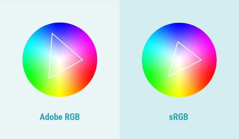
An image is encoded in a file format using one of several color spaces. Most frequently, it will be either sRGB or Adobe RGB.
The topic of color spaces is one of the most complex and developed themes in photography – read more on RGB color spaces in the Wikipedia article.
For web usage, you will have little choice in color space. The widely assumed standard is sRGB and only this space is managed by Internet browsers.
Make sure to prepare your images from the onset in the sRGB color space and you will avoid conversion losses. This can be set in the camera settings or handled in image editing software such as Adobe Photoshop.
12 rules for SEO image optimization
Image optimization for SEO purposes (image SEO) will focus on the visibility of your pictures in the Google Graphics search engine and more widely of your website in any search results.
Images can seriously contribute to your position in Google search results and find themselves listed in Google Graphics favorably, if a few rules are assimilated and kept in website design.
- Research your keywords for an image.
To rank high with an image in a search engine, you will need to know what is being searched for. Plan ahead your image descriptions in accordance with SEO research, which can be helped by numerous platforms such as Semrush, Semstorm, or Ahrefs. Let your images be found where they are looked for!
A clever tip you might use is about adding special keywords to your image descriptions. “Opinion”, “Expert opinion”, “top 10”, “review”, “price”, “comparison”, “ranking”, “test” are the most common keywords added to a category or product to look for information. Answer this need and add them to your image! If you’re selling phones, make it look like: “Samsung s10 test” or “Quick smartphone ranking”. The rule is simple.

- Use a relevant image format.
Just as with resolution and size optimization, Google looks at the format of an image to assess its worthiness to display as a search result. Format will very often define the size and speed of loading, thus influencing Google’s decision. Our quick-tip is: wherever possible use WebP or its followers.

- Keep material quality.
Good quality pays off in higher Google visibility. Do not use plenty of stock images, as they will instantly rank lower. Try introducing as many well-shot images of your products as possible, no pixelation, no blur, high attractiveness. Google will give you the benefit.

- Mind the size of the photo.
The resolution and the size of the photo play a big role for Google. Do not take the “the bigger, the better” approach you might be tempted to. Try to keep your images below 5 MB, to allow quick loading for better user experience and enhance your search engine position. Product images included!

- Lazy loading
For the website to rank higher and its images to be more appreciated by Google, you might use the lazy loading technique. It loads images gradually, as the user progresses through the site, thus allowing more fluent browsing and registering shorter page load times. It will also improve the user experience, as it contributes to quicker access to contents.

- Website map in Google Search Console
Uploading a website image map to Google Search Console will make it easier for the search engine to understand the architecture and placement of images on your website. More information equals more credit here – expect this to improve your ranking.

- Image alt tags
The key to a good image alt tag (the description text you assign in your website HTML to an image via the “alt” attribute) is the clever placement of keywords. Do not oversaturate the alt text with popular keywords, it is better to keep it relevant to the image content and land one or two of them intuitively. In multilingual sites, manage your alt tags for all the relevant languages – it means more localization tasks but certainly is worth doing.

- Position the photo within the website.
It is important that the photo you want to rank highly in Google were placed correctly within the website’s text. Put it close to the text that contains your desired keywords and which it illustrates. The search engine will draw information from this proximity. E-commerce sites will do good by building a structure where the product description and image are well close to each other.
- Don’t forget about the textual content.
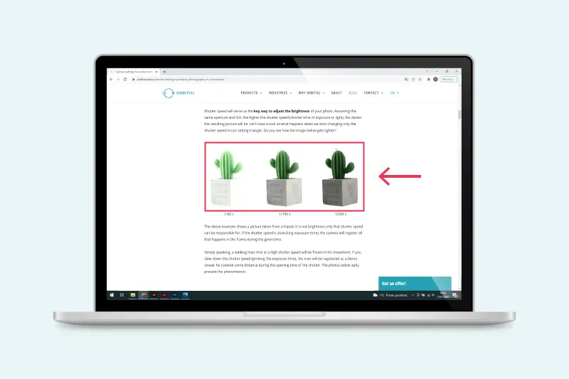
Google is a content search engine. Make sure your textual and visual content are of high quality. Write cleverly with SEO suggestions in mind and illustrate your good texts with relevant images. Step by step, this will pay off as a general strategy for an e-commerce business. This is image SEO taken a step further!

- Avoid putting important content in the image solely.
It is still more difficult for Google to distill content and meaning from images. If you intend to pass important information to your customers/readers, avoid putting it only in the image. As useful as infographics are, it will be SEO-beneficial to keep them described in the text.

- Search engine-friendly URL addresses of images
Not only well designed alt tags, but also clearly named images will be favored by Google. Use hyphens and descriptive names. Solutions such as DSC123123_a.jpg don’t speak about the content of the image neither to the user nor to the search engine.

- Structured data is important.
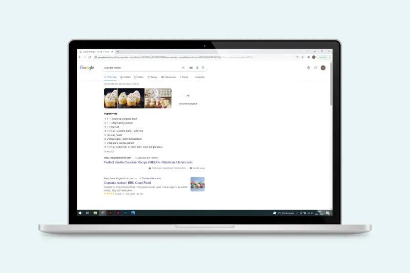
Google designates pieces of content for special modes of presentation that are more prominent than a typical search result. Think of culinary recipes, short bios, product sheets. If you design your website to clearly indicate which content is worth treating as structured data (images included), you may draw benefits from an exposed position in the search results list. Mind it especially for products!
Conclusions
With our guideline lists, we have led you through the question of image optimization. Now, it’s time to employ your knowledge in practice.
Whether you’re building a new e-commerce website or thinking about improving the performance of your existing one, you will need to optimize images in the following areas:
Resolution
It’s all about understanding the majority usage of your website and adjusting the images to work in-line with the finding. Responsive serving of the images will also be key. You want your users to be able to browse on mobile devices, tablets, and desktops.
File size
Find the right format for your images, one that is browser friendly and speeds up load time. Do not hesitate to use powerful (and free) image minifiers, that can reduce the file size up to 70%.
Color space
There is only one choice here – the sRGB color space. It’s optimized for web browsers and widely served on the Web.
SEO
Our list of tips gives a basic outline on how to improve the SEO of your images. Research the keywords, structurize the website, and avoid putting too much info in the image. Think about correct URLs and structured data indication. This, and more, should take you far enough in SEO image optimization.
Ready to start? We wish you best of luck.
Contact us
Got questions? We'd love to hear from you. Send us a message and we will respond as soon as possible.

