Table of contents
- Before you start
- When do you commit mistakes in product photography?
- 1) Unprepared product
- 2) Wrong shape of the product
- 3) Unfaithful texture of the product
- 4) Details rendered incorrectly
- 5) Insufficient depth of field
- 6) Unfaithful colors
- 7) Reflections and shadows
- 8) Inconsistency of product photos across one platform
- 9) Irrelevant background in still life photos
- How do I improve my product photography?
- Final thoughts
Before you start
When shooting product photos, you will always aim to present the product in the best light. The joke is on you, if you fail to set the light correctly and the resulting photograph is under-par or even misleading. Perfecting your skills to avoid mistakes will require time and effort. Perhaps a look into our articles on packshot photography and product photography workshop will help for a good start.
For now, we will focus on the main obstacles of knowledge and equipment that lead to most common mistakes. Let’s examine the execution shortcomings and formal errors which can happen to anyone in product photography.
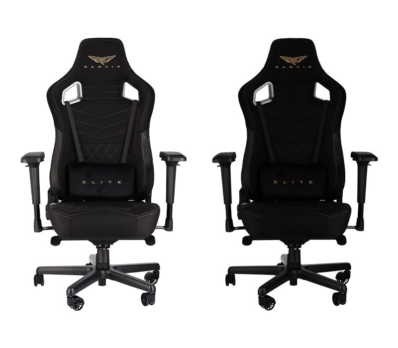
When do you commit mistakes in product photography?
Mistakes can happen to anyone but certainly there are a number of circumstances that increase the chances of them cropping up in product photography. We will gather them in 5 categories:
- low budget
Some mistakes cannot be avoided on a low budget. Better equipment and more knowledgeable staff can only be hired at higher costs. Think of lens quality for photo sharpness or photographic experience for lighting fluffy products.
- haste
Even the most experienced photographers are prone to mistakes when working on a tight schedule. The constant pressure of deadlines and time requirements limits their ability to focus and notice smaller details so characteristic of their work. In the end, time savings gained on a hasty product photography session will be consumed by costs generated by lower quality.
- knowledge gaps
Investment in photographic education is one certain way to prevent many mistakes that a beginner can commit. Lack of technical knowledge with regard to camera settings, shortcomings of session planning, or even a gap in sales experience may lead to worse product photographs.
- goal awareness
Mistakes can occur, if not enough attention is paid to explaining the main goal of a product photography session to the photographer. Is the photo shot to encourage purchase decisions or rather to inform the customer about the product? Are we to stick with the traditional styles of photography or maybe follow some modern trends? A quick visit to Google graphics search and a business conversation can help to prevent goal unawareness.
- human communication
A product photography session is usually an enterprise for a number of persons. Between those who set the goals and those who take the actual photographs, a team needs good communication for seamless execution of ,,,tasks. Conversation is key, a language of signs can also be helpful, plus keeping track of the requirements in a written form.
TIP: What do I need for product photography?
There are 3 requirements for good product photography. Studio and equipment, knowledge and experience. The final two grow along with the engagement and new projects, while investments might be needed to ensure the right quality of equipment. For more information on lenses for product photography, take a look at our advisory article. Follow our blog closely for detailed advice on different aspects of still life and packshot photography.
Furthermore, you need to remember that mistakes can be committed because of going against the convention. There are two branches of product photography: packshot and still life. We have written extensively on this distinction in our quick guide to packshot photography and the complete guide to product photography.
For now, it will be important to remember that in packshots the product is presented as it is, as close to reality as possible, frequently even packed. The background is uniform, often white, and there is little space for artistic creativity. In still life photography, you will be able to introduce comparison items, build compositions and run more freely as to backgrounds and frame compositions.
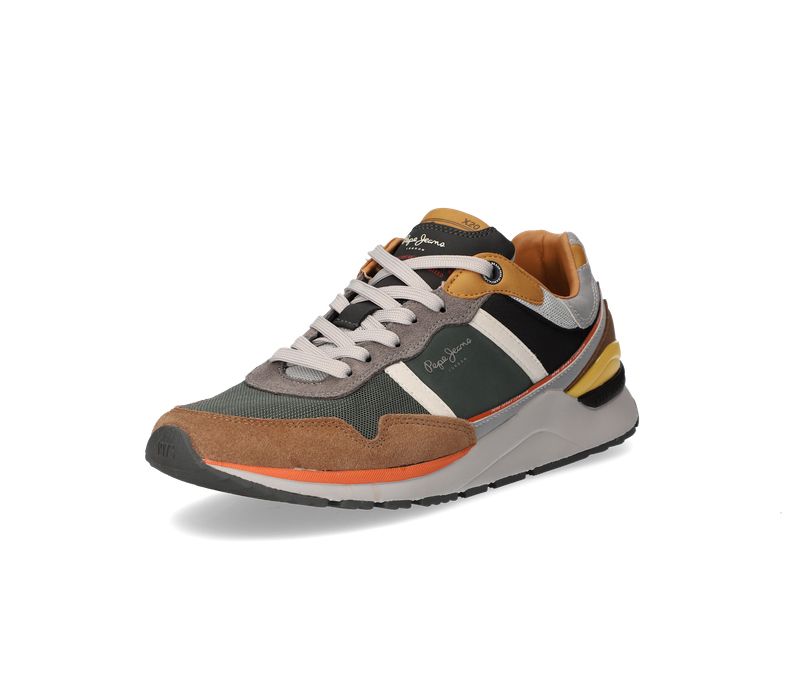
A packshot
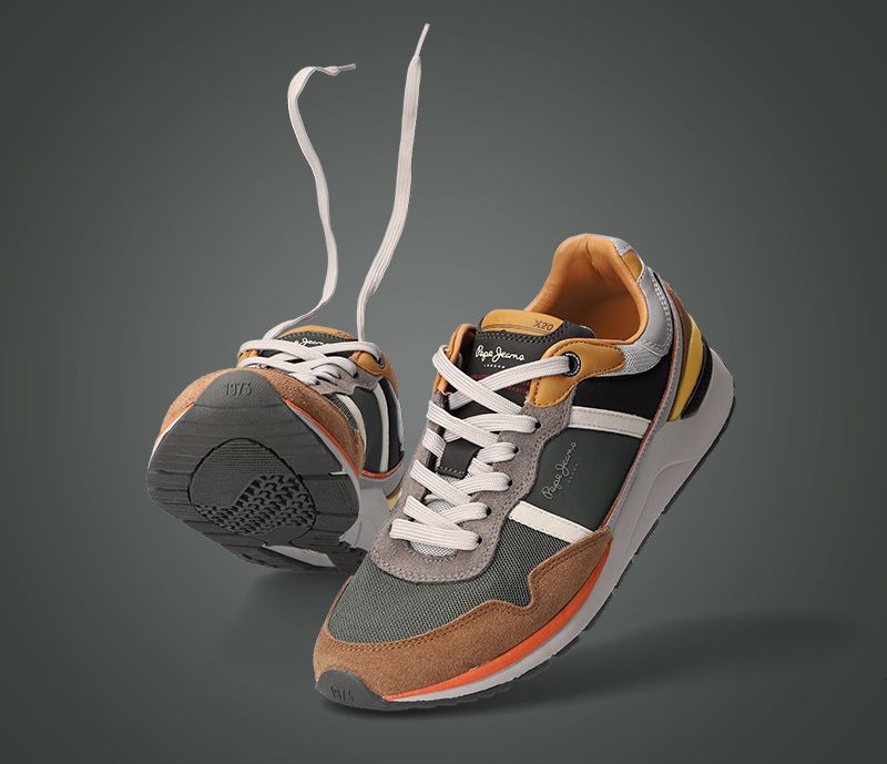
A still life
A mistake can easily happen, if you confuse these two branches and decide to include elements of one in the other. Take a product not fully included in the frame as a good example of a packshot mistake. Or simply a boring, white background, sharp presentation of a product in a catalogue where it is meant to make the viewer feel something – the purpose of still life photography is then missed.
Let’s have a quick look at what mistakes are most common in product photography. Starting from product preparation to camera settings and post-production.
1) Unprepared product
Product photography exposes every detail of the product. It is due to the resolution and the availability of close-ups. This “risk of precise presentation” is the reason why preparing a product carefully is as important as shooting the photograph. Take care to remove lint or dust from the product and avoid leaving fingerprints.
- For a glossy surface product – use a microfiber cloth to clean the surface and put on white cloth gloves to position the product.
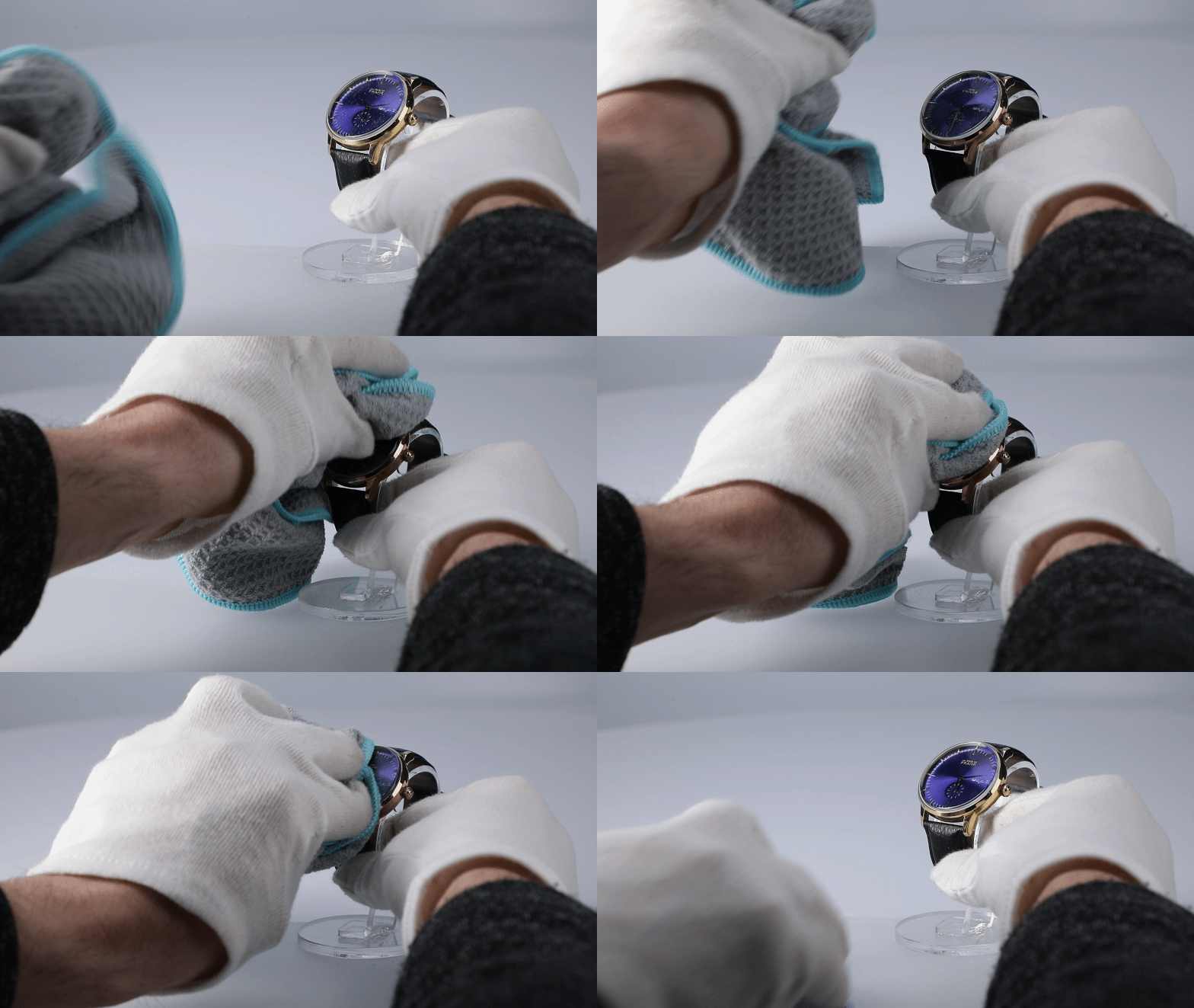
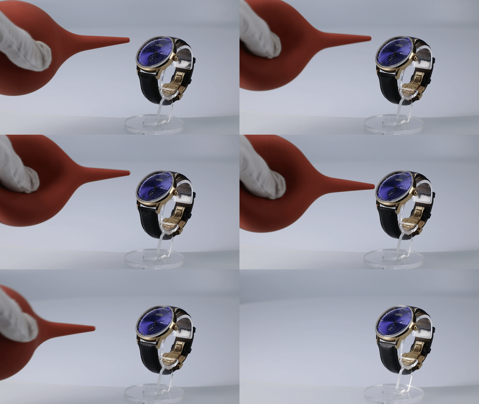
- For surfaces where dust might be visible – use compressed air from a manual or spray compressor to blow the dust off the surface.
- For clothes – it is important to avoid creases and stains. Spend the needed time with an iron and a lint remover roll, try to photograph the products when they are still new.
Ironing and cleaning clothes
- For atypical products – sometimes products might look better when they are stuffed or presented on mannequins (mainly clothes). Do not hesitate to use these external aids. Think of a backpack that is more attractive when full than in flat lay photography.
2) Wrong shape of the product
The best way to present the shape of a product in full extension is 360 degree photography. You can read a full guide to 360 photography where we outline the methods, advantages and costs of this branch of photography.
A common mistake might be committed, if you do not present the shape faithfully enough – by resigning from a 360 view or producing a flat looking series of packshots. A customer, being able to see all the angles of a product, will be more willing to make a purchase decision. After the delivery, there is also less chance of disappointing them at parcel unpacking.
A good way to avoid presenting the wrong shape of the product is to make a 360 spin available in the shop or take a longer series of packshots showing the item from all its sides. Examples speak for themselves.
3) Unfaithful texture of the product
In e-commerce it is key to offer the customer quasi-real life experience of the product. Naturally, you will be worse off in this regard than street-retail but there is a number of tricks that might help you. Aim at presenting the texture faithfully and attractively.
Failing to do so is often a mistake we encounter in online shops. What are the ingredients of a good texture presentation and a quasi-sensory experience of the product?
- Expose the irregularities of the surface. This matters for strangely shaped products as well as items where the 3D experience is key.
- Expose what the product is made of. Purchase decisions for clothes will often be taken based on the understanding of the material of the item. Make your photos show precisely that these trousers are made of corduroy or this dress is velvet.

To achieve this, you will need to manipulate lighting and angles of the photograph. Try applying different light angles, remembering that frontal light (90 degrees) will render your product flat. At other angles, shadows will come into play adding depth and plasticity to the product.
Maybe a shot with light at 45 degrees will effectively show the bulges, creases and fluffy surface? Do not be afraid to experiment and adjust the light frequently.
4) Details rendered incorrectly
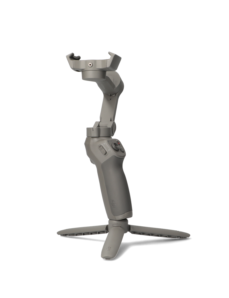
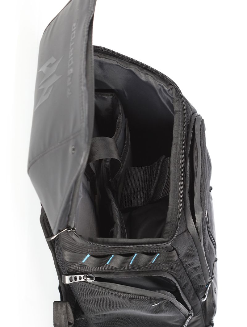
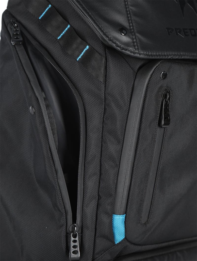
Rendering the texture of the product is just as important as attention to small features of the product. Items often have hidden features or elements that might be attached separately. They offer additional functionalities and change the possible uses of the product.
If a customer fails to observe some important parts of your product, they might turn to a different shop, where more care was given to all-around presentation. It is especially crucial in the times of growing e-commerce competition and consumer habits to rely on visual online presentations.
Take care to present all the switches, pockets and mini-functionalities of your product and devote separate photos to them. A virtual tour of the product in a HTML5 viewer might be a useful way to stay precise in product presentation. A customer will be well-informed, when they can spin the product, see it from above and zoom in some details.
5) Insufficient depth of field
Depth of field invites potential mistakes. If this parameter is not given full attention, some parts of the product in the photograph might come unsharp and blurred. This withholds plenty of information from the customer and might easily turn them away.
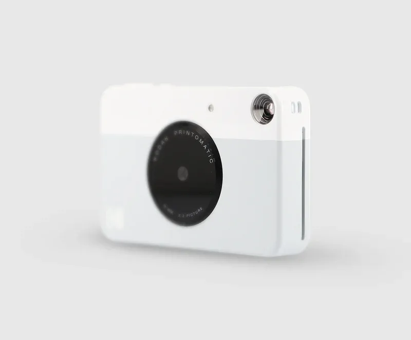
It will be beneficial to use camera settings that allow to present the product in full sharpness. Unfortunately, the smaller the item is, the less possibility you have to present it in full depth of field. We wrote about this potential problem in our camera settings for product photography article.
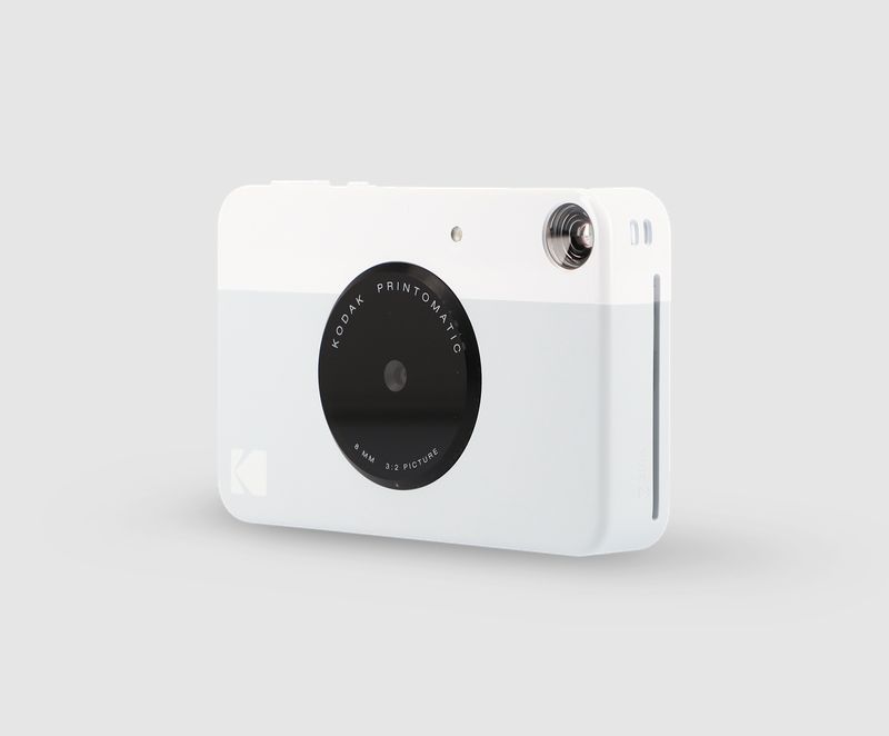
This is when the focus stacking technique applied in post-production will be helpful. You will need to juxtapose several photos with the focus on different parts of the field in photo editing software. A precise and time-consuming process. Automated photography solutions, such as these from Orbitvu, allow you to apply focus stacking at the photo production stage automatically and within seconds of machine processing.
6) Unfaithful colors
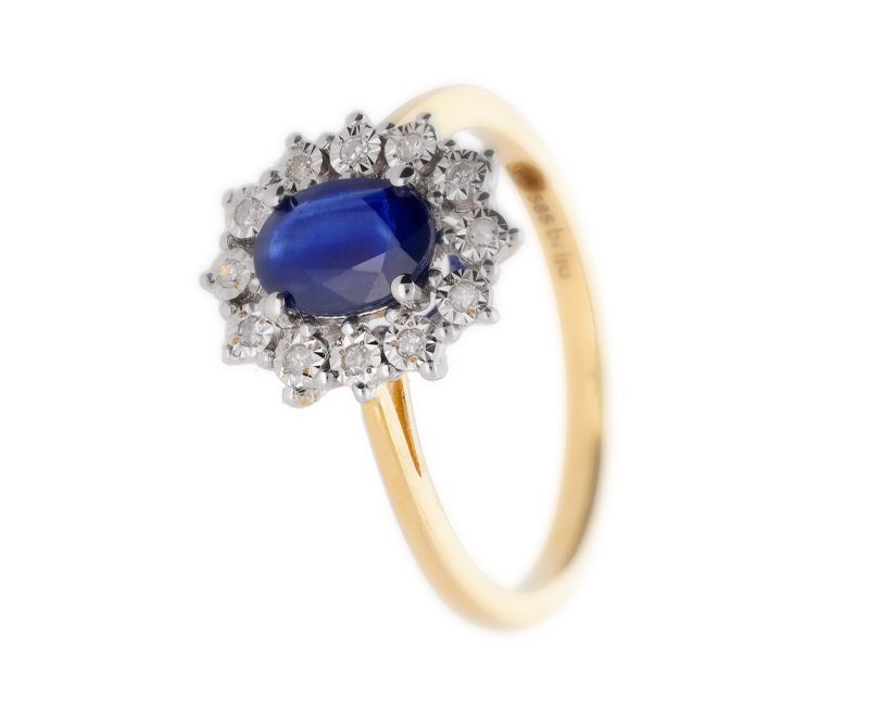
Very often this mistake happens when the retoucher aims to make the image attractive and oversteps the boundary of realism. Overly saturated colors, pumped up vibrance and contrasts – these are the most common examples of unfaithful colors.
In post-production, you need to keep in mind that the customer will be viewing the product on different devices: laptops, smartphones, desktop computers. The quality of the screen will influence the product experience and this is precisely why it is best to play it safe and keep the color palette well-optimized.
This might mean using the sRGB color space (web-recommended) and limiting the post-production effects. Otherwise, you might unwillingly convince the customer they are buying a different product and prepare yourself an additional return.

True colors

Unfaithful colors
7) Reflections and shadows
In product photos, there is always a risk of studio light reflections in glossy surfaces. Photos of rings with unwanted white reflections on gold, plastic foil packaging of products that becomes too visible due to reflecting light, or maybe a glass wine bottle that refuses to show smooth surfaces of deep green. Photographers know it all too well and often succumb to mistakes in this area.
Shadows well-managed
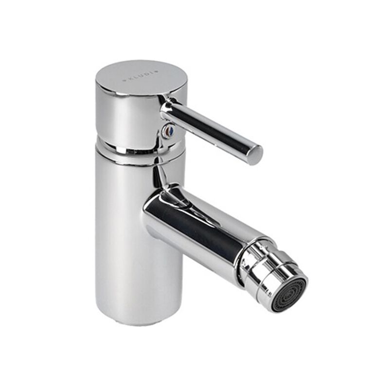
Shadows too visible
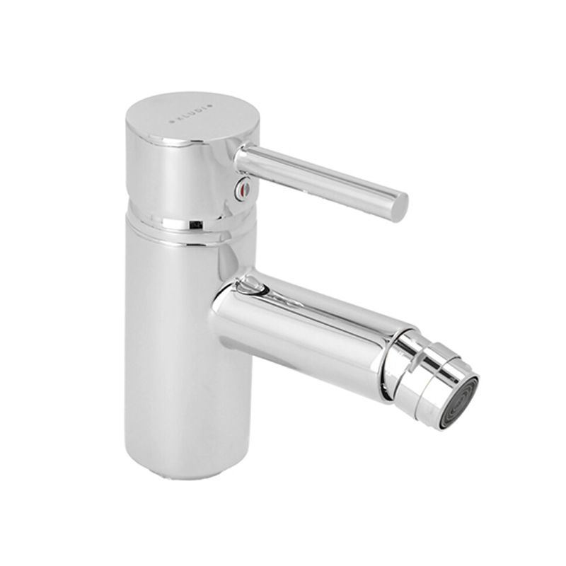
A different problem with lighting can come, when you get to managing shadows in the photograph. Too deep shadows produce an unnatural look and bring more associations with art photography. What’s more, they hide many details that would otherwise be visible on the product.
The way to deal with deep shadows is to allow the main light to reach the product from all angles or use directed lighting from additional lamps. With a little photographic experience, you can arrive at a good level of skill in light setup for different effects. Draw a lot of lighting plans, test them out, and learn.


Shadow and reflection details in the photo can be key for the customer’s choice of where to buy an item. A shop that presents its products with mistakes – too glossy or overburnt photo fragments, too deep shadows – will automatically cause their customers to move to a place where more professional product rendering is available.
TIP: How do you set up lighting for product photography?
The question of lighting in photography is a wide river to cross. For shadows, you apply non-frontal light, while for best texture presentation angle lights will also be helpful. Sometimes you will need to significantly dim and scatter the light with diffusers, which will prevent unwanted reflections or soften the contrasts. For a more exhaustive approach to lighting in photography turn to our complete guide to product photography.
8) Inconsistency of product photos across one platform
Packshots are most commonly used on e-commerce websites to present products for sale. This requires consistency in style and technique across one platform. Shots should be repeatable and similar to serve as an element of a brand for the seller. What kind of mistakes go against this requirement?
- wrong cropping
The risk of placing the product in the wrong part of the frame is magnified by the use of various photo presentation systems on websites, which will add their own cropping and zoom to the ready photograph. If a product is located on the left side of the frame, and then another one in the centre or on the right side, the impression of consistency is damaged and the e-shop loses points for professionalism.

- non-standard background
A flurry of colored backgrounds in photos describing one product, or even a series of products, can add artistic effect of unexpectedness but may as well give the impression of disorder and disorganization. A background standardized across one platform is recommended to reduce the bounce rate of customers in the shop and keep the viewers for interested in products for longer.
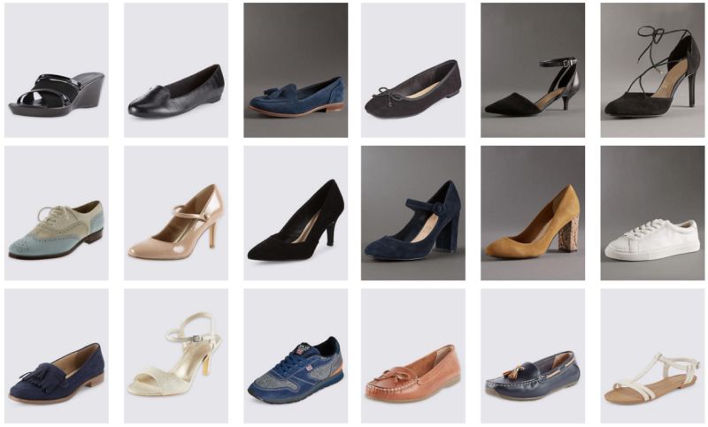

Tending to minor details of cropping and background will take not as much time, especially when using automated solutions. Orbitvu software does cropping and background removal automatically via templates in a streamlined workflow from the photoshoot to the online publication. A manual approach can also be implemented, as long as consistency and repeatability standards remain clearly defined for the post-production.
9) Irrelevant background in still life photos
When shooting still life, a mistake can occur already at the moment of choosing the background. Very often, in faulty still life shots, the background speaks more clearly than product or is completely irrelevant in color.

Think carefully to pair the product with the background. An understated harmony will serve the product best – the background will softly and elegantly underline the features of the product or provide additional more remote associations. Wood as a background for food or steel for electric appliances may be a good example of how to approach the question of harmony.
It is equally important to choose the accompanying items with attention. They need not to steal the show from the product or offer too much contrast. The aim will be for them to be the support of a message rather than the focal point or irrelevant mess. What would you say, if you saw a kettle advertised in a shot together with a kitchen knife?

How do I improve my product photography?
Everyone commits mistakes before they reach the master level. Avoiding the above 9 mistakes in product photography can be the first step on a ladder of realizing other mistakes characteristic for your personal workshop.
Our advice for an effective learning curve would be to note all the mistakes you commit and give them a serious thought. Collect feedback from customers and supporters of your business to monitor the public opinion. They will have the final voice in evaluating your ecommerce, as they vote with purchases and recommendations. Finally, you can refer to professional advice of photographic studios and branding agencies. They will help you to build a consistent image of your business and give tips as to the effective creation of visuals. An investment in professional consultation will often pay off with increased sales and lower bounce rates.

If you are aiming at reducing the number of returns in your e-commerce business, read our comprehensive guide, where we list 11 easy steps to do it just by means of product photography.
TIP: How do I take DIY product photos?
Our final tip is for beginners in product photography and e-commerce. Do not get discouraged by the crisp looks of professional packshots on the websites of the biggest players in the online sales game. You can take DIY product photos at home with the aid of a carefully thought-out studio or with an investment in an automated solution. The quality of your shots will most probably not stray so far from the top-achievers on Amazon and you will be able to control all yourself and learn. We write more on DIY product photos in a separate article.
Final thoughts
A list of possible mistakes in product photography is not a closed set. New issues arise with every challenge a photographer is faced with. Glossy or fluffy products, still lifes for extraordinary purposes, or maybe a photo session outside the photo studio?
On your learning curve in product photography, you will have your own milestones and surely a lot of surprises. Do not hesitate to let us know about them in our social media. Maybe there is an issue pinning your attention that automated photography can be a solution to?
The more awareness you build of your goal in product photography and the higher your experience, solutions will come your way.
Safe learning and plenty of seamless shots!
Contact us
Got questions? We'd love to hear from you. Send us a message and we will respond as soon as possible.


