How to reduce the number of returns in e-commerce in 11 easy steps?
In 2020, the growing trend of online shopping gained additional momentum. No doubt it will continue in the near future, conquering new sectors of the market. Even in this online boom, many online stores are affected by a large number of returns, which proves troublesome and generates costs for businesses. According to Barclaycard, UK shoppers are returning 7bn GBP each year in the UK alone. So, how to reduce returns in ecommerce?
In this article, we will take a look at the origins of most ecommerce returns and identify 11 easy steps to help you overcome the issue of returns with the aid of product photography.

Table of contents
- Why do people return products?
- What you see is what you get!
- 1) Showcase your product
- 2) Provide images with a human model
- 3) Produce rich content
- 4) Crowdsource some photos.
- 5) Give size impression
- 6) Prepare the session and limit post-production
- 7) Show proper colors
- 8) Highlight the texture of the product
- 9) Avoid extensive post-production
- 10) Highlight the details of the product
- 11) Try to keep your customers up-to-date
- Summary
Why do people return products?
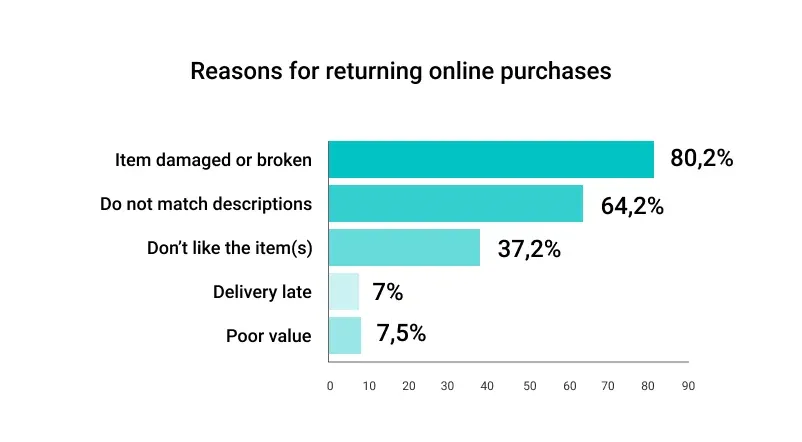
According to research by SaleCycle basic reasons for product returns indicated by the customers are related to faithfulness of description. 80.2% pointed to delivery damage or a broken product as the main reason, while 64.2% of the survey respondents mentioned an unmatching description of the item and 37.2% didn’t like the product.
Research has also shown that product information in a listing is of key importance. 42% of the Shotfarm survey 2015/2016 respondents returned a purchased product over the previous year due to poor product content.
The product return rate is different per product category, nevertheless, product information plays a vital role in how a product will be interpreted by online shoppers. Product features, texture, color, description build a mental interpretation of a product in an e-shopper’s brain. So it doesn’t matter if you have your own e-store or sell your products on e-commerce platforms like Amazon or eBay, you need your product to be as faithful to the reality as possible.
Expectations vs. reality
When the product is unboxed, customers’ imaginations about the product confront reality. Should the disproportion be too large, the product goes back to the warehouse. It’s worth mentioning that both too poor and too good product presentations can create a disproportion big enough for the customer to return a product.
There will always be buyers who can be categorized as notorious overshoppers and those who make use of returns to gain first-hand product experience with no intention of keeping all of the purchased goods. The rest of them, the confused clients, can surely be better served through listing improvements.
Gaps in descriptions will be best answered by better and more informative visual content. Scale, texture and product use questions will be addressed in still images, 360 spins or videos.
So what steps can be taken to provide customers more attractive and truthful visual content? Learn about the best practices below.
What you see is what you get!
The principle that will serve as a guide across all possible improvements is already famous: what you see is what you get (WYSIWYG). This will boil down to showing your online shoppers the most realistic depiction of the product possible.
Do you remember situations where the unboxed product completely missed your expectations built up with an online product listing of a shop? A shoe that was lilac-colored rather than perfect crimson? A bag smaller than you thought? Think what kind of relationship you expect between a product photo and reality. To which level marketing creativity can obscure the truth? And then arrange it with the photographer to put all your reflections in action.
This will include not using graphically designed illustrations or computer renderings. And a fond faithfulness to the rule that one picture can convey more information (and more effectively!) than lengthy product descriptions.
Let’s see what it means exactly with regard to photo composition and exposure.
1) Showcase your product
Plan the image of the product to show the most important features – all the switches and subsidiary functionalities. The focus may be both on the general impression and details as long as the photo stays sharp throughout the whole depth of field. Take several shots at different positions to give shape and size impression. Use close-ups to show product details. Use proper lighting to highlight product texture.
For more insights on quality product photography, check out our article: “The Complete Guide to Product Photography”.

2) Provide images with a human model
User experience experts have ruled unanimously: the presence of human models in a product listing has a positive impact on customer confidence and, in consequence, on the return rate. Try to employ live models and maximize the benefit of their presence.
This would mean that your shots will represent the size and scale of the product in relation to the human body. Your customer will be able to project the item in their imagination and build buying intention even without reading the specifications. A very important improvement, especially in fashion or cosmetics.
Human models will help to present critical attributes of the product, such as the draping of the material, the length of a skirt on the knee or if the shoe covers the ankle. They will specify the destination group – whether the product is a version for children or whether you are viewing a typically feminine cut of a sweatshirt.
Clothes and accessories, when worn, display the primary use and bring the customer closer to real-life experience. The color of a lipstick on different complexions or a backpack on the back of a bearded traveller will inform and evoke emotions.
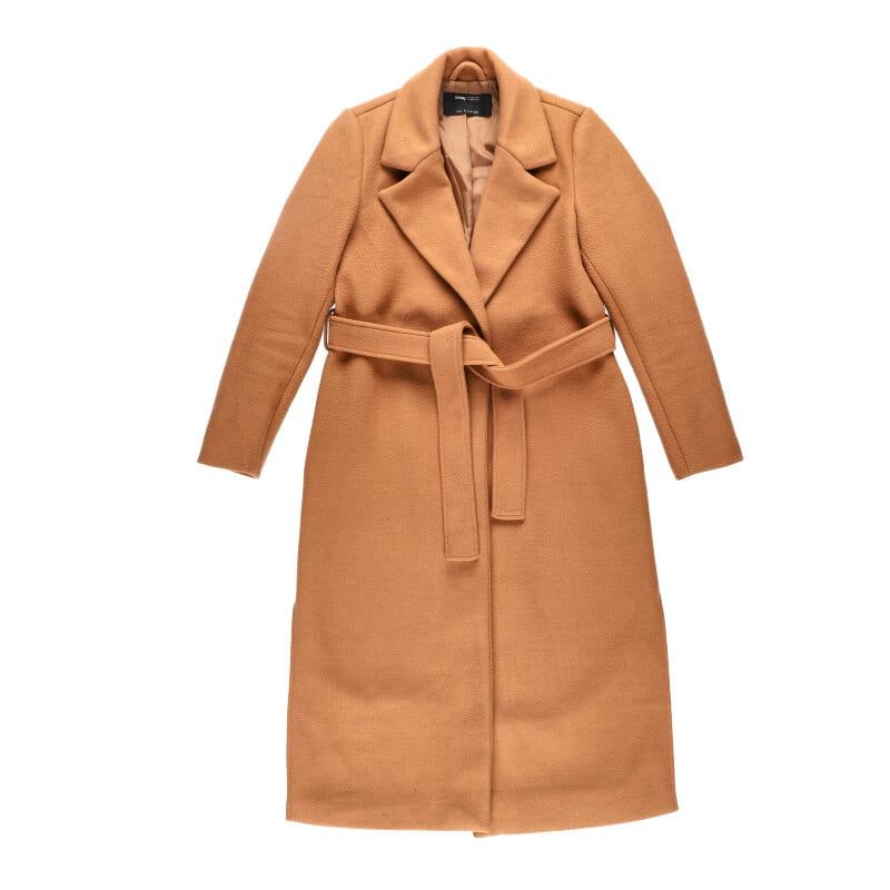
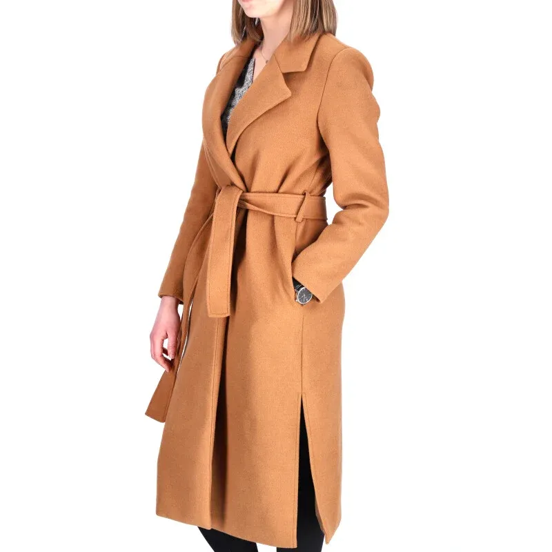
What’s more, live models give you a chance to show related products. You build sets of clothes or accessories and get an opportunity to link to other listings. This way, not much is left to chance and a customer’s imagination is offered useful hints.
Consider live model videos which can add another level of information: how the material behaves when bending, when moving in the air? Is it a heavy or a light textile? By watching a 10s video clip an e-shopper can interpret the product in a more informed way.
3) Produce rich content
To diversify the content and provide more detailed information, think of including 360 degree spins of your products or 3D presentations and product videos. No other type of content provides information as detailed on product features, shape and texture. Interactive spins can better visualise the product in the human brain. It can also provide hidden information you never thought to describe, but which can be critical in the decision to return the product.
Our ultimate guide to 360-degree photography explains the benefits in detail.
A rich listing will be more fun to watch, will keep the customer longer on your website, and, what’s most important, will provide plenty of useful insights into what your product really is.
4) Crowdsource some photos.
Another good idea to enrich your ecommerce listing is crowdsourcing. Ask your customers to post photos of their interaction with the product and publish them in a separate section.
This will certainly make your page livelier, but also add another source of information about the product. You gain access to stylizations and backgrounds you would not be able to find for your product otherwise. And the customers get to understand how the product works in real life with others like them who have already bought it.
All this is likely to reduce the returns rate – more social proof makes the buyer more confident, while more information about the employment of the product may deter them from buying “just to try”.
Crowdsourcing of photos will also serve your marketing purposes as a way to get visual comments and may keep customers positively engaged around your brand. Use various hashtags, organize photo challenges, and let your customers show off a bit. They will realize they need your product for longer.

5) Give size impression
The message of this step has been summarized effectively in our “What you see is what you get” and “Human models” sections but there is never enough repeating this mantra.
The employment of various scale representation techniques is invaluable to the customer. Use human models, drawn scales, or accompanying products, so that it remains clear from this one view the customer interacts with that the product fits their expectations.
The human body stays the most intuitive measuring standard but you can venture into such segment dependent standards as bottles, furniture, and many others. There will certainly be no harm in showing your bracelet on an arm or putting your bottle of champagne on a table.

6) Prepare the session and limit post-production
Try to prepare the product for the shoot-out as good as you can. Depending on what the subject is, clean the surface, remove the dust, iron the fabric, stretch it. You will save time and money in post-processing later, as you will have prevented intruders such as fingerprints or lint.
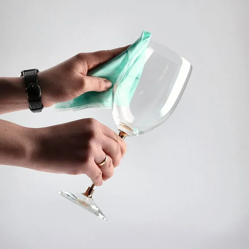
For jewellery and metal products, it may be a good idea to use compressed air to blow off the dust and apply a final wipe with a white linen/microfibre cloth.
Paper cloth is not advised for glossy surfaces, as pieces of it often detach and this solution is not as electromagnetically useful. To handle the product you can use cotton gloves, which should eliminate any fingerprints.
If you decide to photograph without models, clothes may need to be laid out properly on a flat surface. This means after careful ironing of all the folds and creases.
A good general look into preparing a product for a photo session is given in our extensive product cleaning guide. Start fighting the unwanted spots now.
7) Show proper colors
People shop online on a variety of devices: smartphones, laptops, and desktop computers. This will encourage you to make your product look as natural as possible on all screens and devices.
To see how important it is, check the example below:

What happens if you boost the colors of your product to an unnatural level? The online customer is convinced that they are buying what is seen on the screen. In this case, they will get a product which is ultimately different from what was presented. A reason for an ecommerce return is ready.
8) Highlight the texture of the product
Online shops are naturally in a worse position than street retail when it comes to real life product experience. Much of our shopping is done with our senses involving touch and smell. This is especially true with fashion and beauty products. With product photography you need to meet this limitation by providing as good a sensory experience as possible.
To help the human brain visualize the product as in real life it is crucial to render the texture and feel of the material carefully in the photo. You will need to expose all the irregularities of the surface and differences in what the product is made of.
To achieve this, try manipulating the light. Texture will be best shown by inviting some shadows through various angles of the lighting. Frontal light (90 degrees) will leave your product flat and uniform, while using the angle of 45 degrees or less will gracefully underline the holes and bulges. Rougher surfaces will gain plasticity and soft fluffy materials will not lose their appeal.
Do not hesitate to use contrasting lights applied from different angles and spend the necessary time in the studio to perfect your effect. The photos below will help you to understand the idea of a live texture-faithful product photo and one poorly taken where texture did not receive enough attention.

Texture not exposed

Texture well exposed
9) Avoid extensive post-production
In an effort to sell the product you might fall into the trap of non-necessary post-production. You would strive to present the product attractively, changing its colors or adding sharpness, and this may lead to creating visual information that strays far from reality.
Unfaithful product presentation is, as we indicated earlier, one of the key reasons for product returns. To find the right balance between sales and information purposes of a photo, you will need to avoid a series of natural mistakes in post-production.
The first of them is losing the balance of colors through increasing saturation and vibrance, all in order to catch the eye of the customer. It would be better to stay at the “just enough lively colors” level, which may be eventually found through visual experimentation.
Then, you might also want to retouch and heal/polish the surface of the product to a degree where it is smooth and enticing but the customer loses the feel of the texture. While retouching, stay aware of the general effect and big picture to avoid this mistake.
Finally, take our word for that too much contrast or too sharp edges kill the impression when the customer gets more interested in the product and starts examining it more carefully. Again, this is a question of proper balance between the first impression and the true image of the product.
See the below examples to build for yourself an idea of too much retouching, too vibrant colors and contrast level gone too far.

Too much post-processing

10) Highlight the details of the product
“The devil is in the detail” might be a very good maxim for online retailers. Your product photography should use [high quality] high resolution for better rendering of the detail. Something that is a reason for one person to buy the product for another may be a reason for a return.
Do not limit yourself to one photo of the product and show as many views as possible, keeping in mind not to exaggerate. It may be time to implement new technology such as 360 degree presentations or videos.
One such solution, Orbittour, is delivered as a feature of Orbitvu automated photo studios. This interactive 360 spin presentation is an example of the use of modern technology to show the product in an attractive way.
The customer will be able to see the functionality, color, or texture and decide if this is the product they have been looking for. With hot spots and additional views from different angles you can show all the important details within one embedded browser script. An example can be seen below.
11) Try to keep your customers up-to-date
Keep the product description and photos up to date. As soon as the manufacturer or the supplier changes the packaging, logo, color or any other detail of the product, update it on your online store. A simple tip that will save you a lot of irrelevancy-based returns and can be applied without additional processes. It might well serve you to remind that even your customer’s imagination has limits.

Older version

New version – so similar, yet new!
Summary
Our 11 tips to reduce the returns rate in your ecommerce focus solely on product photography as a solution. UX research has shown that you will be able to go down on the number of returns by offering precise visual information.
A job well-done at the listing preparation phase will spare important time for you later, which may be given to other return process-related issues or any customer-empowering actions that modern markets put so much to the fore.
Stay connected for more product photography tips and surf the ecommerce seas safely.
